
5 years as their designer, from local shows to a signed record deal
〰️
5 years as their designer, from local shows to a signed record deal 〰️
PRoject
I had been a fan of Gasoline Lollipops for nearly 15 years when I anonymously entered a poster contest for the band and won. That poster led to a creative partnership that lasted more than five years, spanning brand identity, web design, merchandise, event posters, album artwork, digital releases, and live-show graphics.
That closeness gave me a real understanding of their music and audience. My role grew from single pieces to a visual identity built to evolve with the band.
Finding the Opportunity
Gasoline Lollipops' sound doesn't sit neatly in one genre. Their self-described PAFCR mix, psychedelic, alternative, folk, country, and rock, meant a polished or conventional band identity would never quite fit.
The opportunity was to create recognition without sameness: a visual system with enough character to feel distinctly theirs, but enough flexibility to move from a punk-influenced gig poster to a Southern Gothic album cover without feeling like two different bands.
BUILDING THE DIGITAL EXPERIENCE
The website needed to do more than introduce the band. It had to give fans a central place to explore the music, discover shows, learn about the band, and stay connected.
Because I knew the catalog well, I also saw an opportunity to give the lyrics a permanent home rather than leaving fans to search for them elsewhere. I designed the experience around the way people actually engaged with the band, bringing music, lyrics, tour information, and fan touchpoints together in one place.
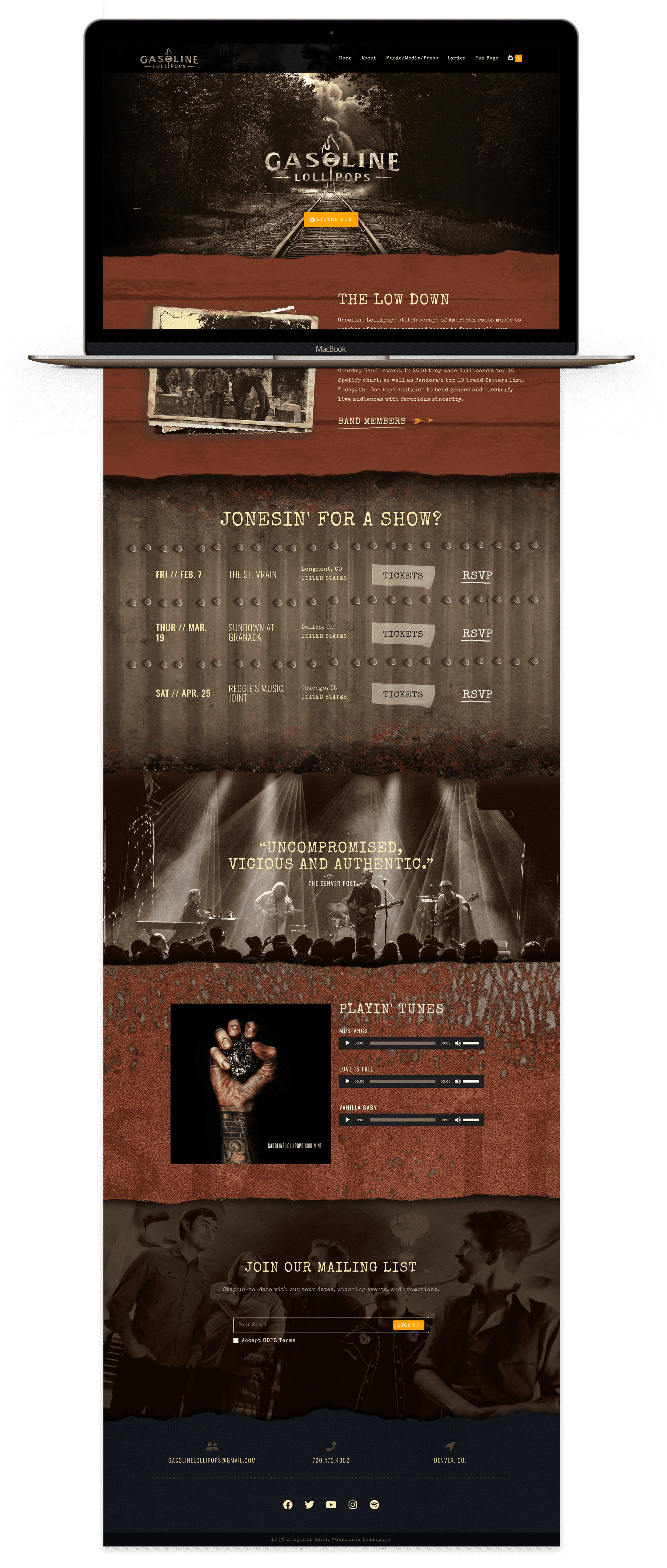
The About page turns the band's story into an experience rather than a standard bio. I used layered photography, torn-paper transitions, and individual member profiles to create a long-form narrative that feels connected to the band's music and visual world.
I saw an opportunity to make lyrics part of the experience, something I hadn't seen many band websites prioritize. I created a dedicated section where each album opens into its full track list and lyrics, giving fans another way to engage with the music without leaving the site.
Merchandise and the Shop
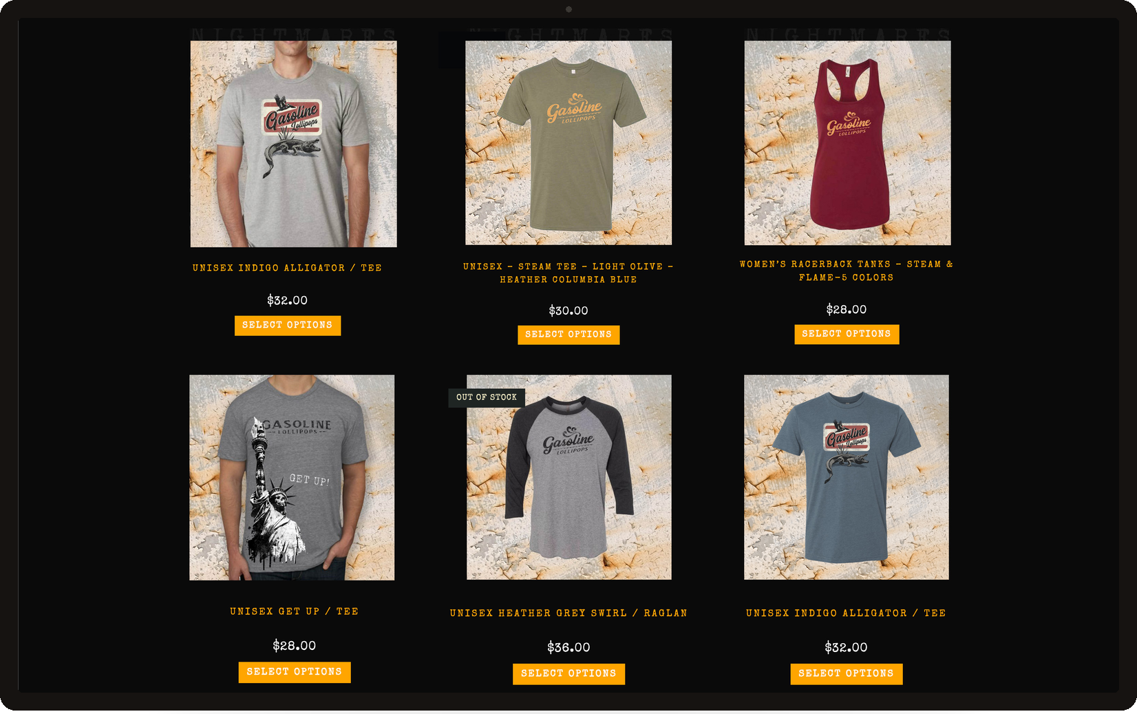
Merch gave fans a way to carry the identity home. I extended the visual system across apparel and built a cohesive shop experience, so the brand felt as considered off stage as it did on it.
Building a Visual Language
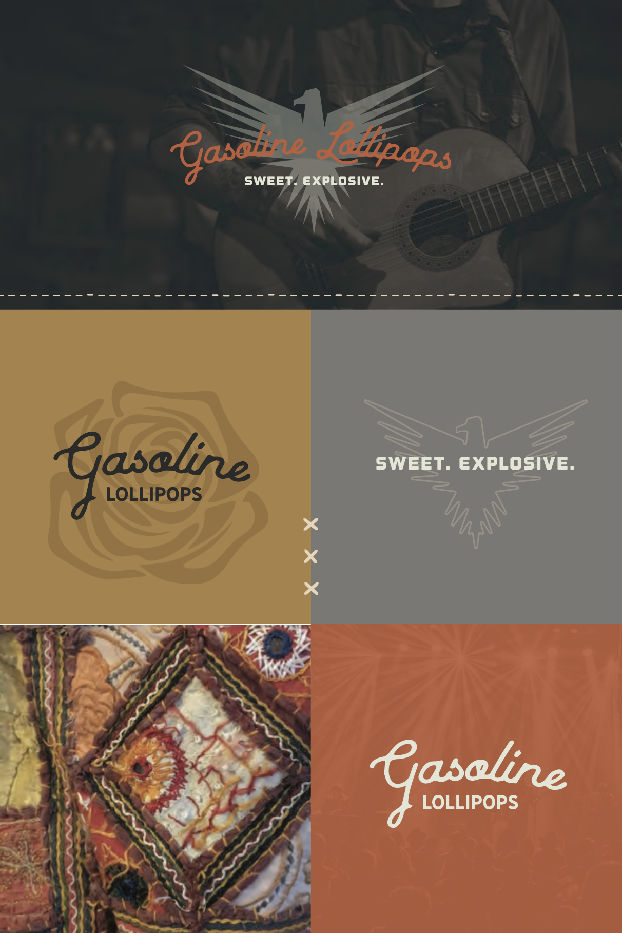
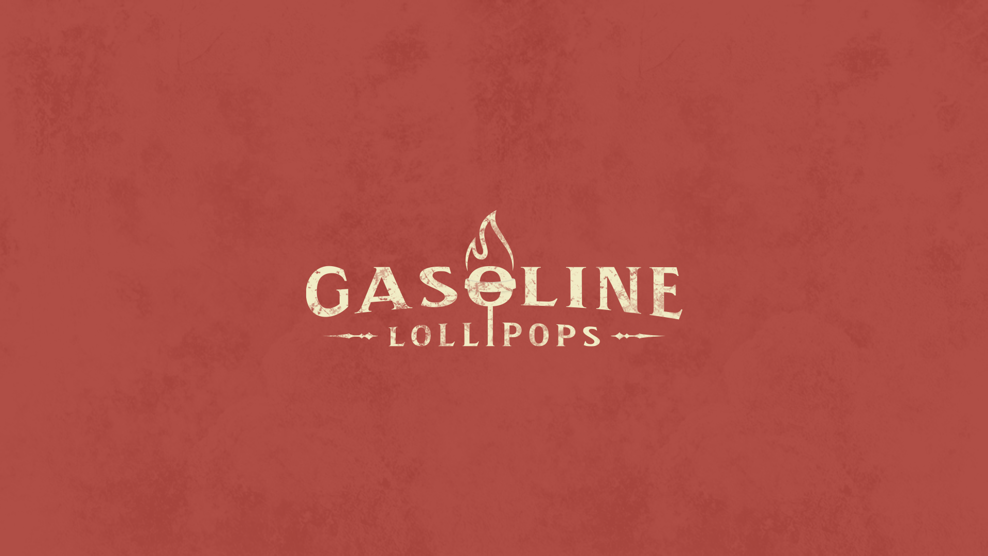
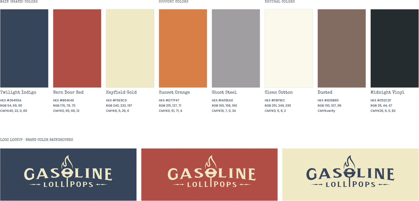
The identity went through several rounds of exploration before landing on a single flexible mark. Rather than locking the band into one treatment, I built the system to adapt across color, texture, photography, and illustration, giving each release room to develop its own character while maintaining a recognizable foundation.
LOGO EXPLORATION
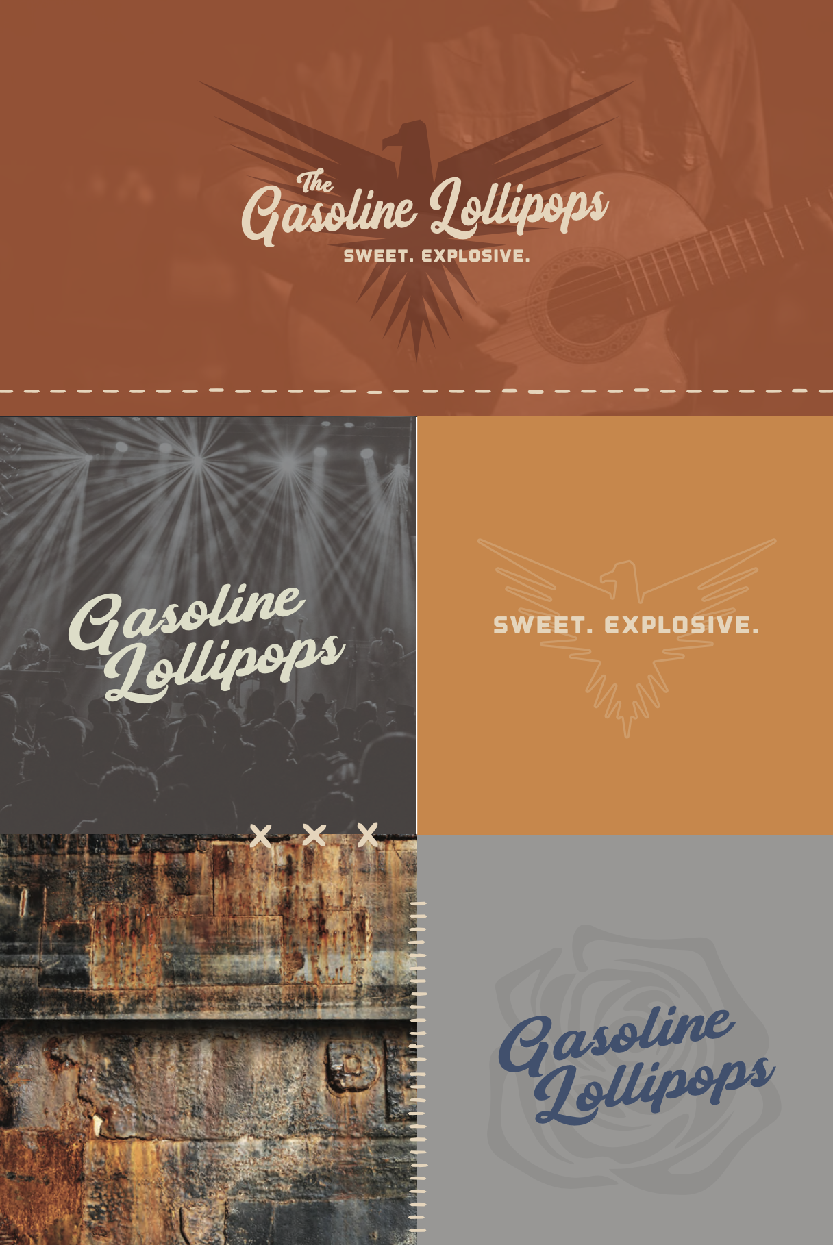
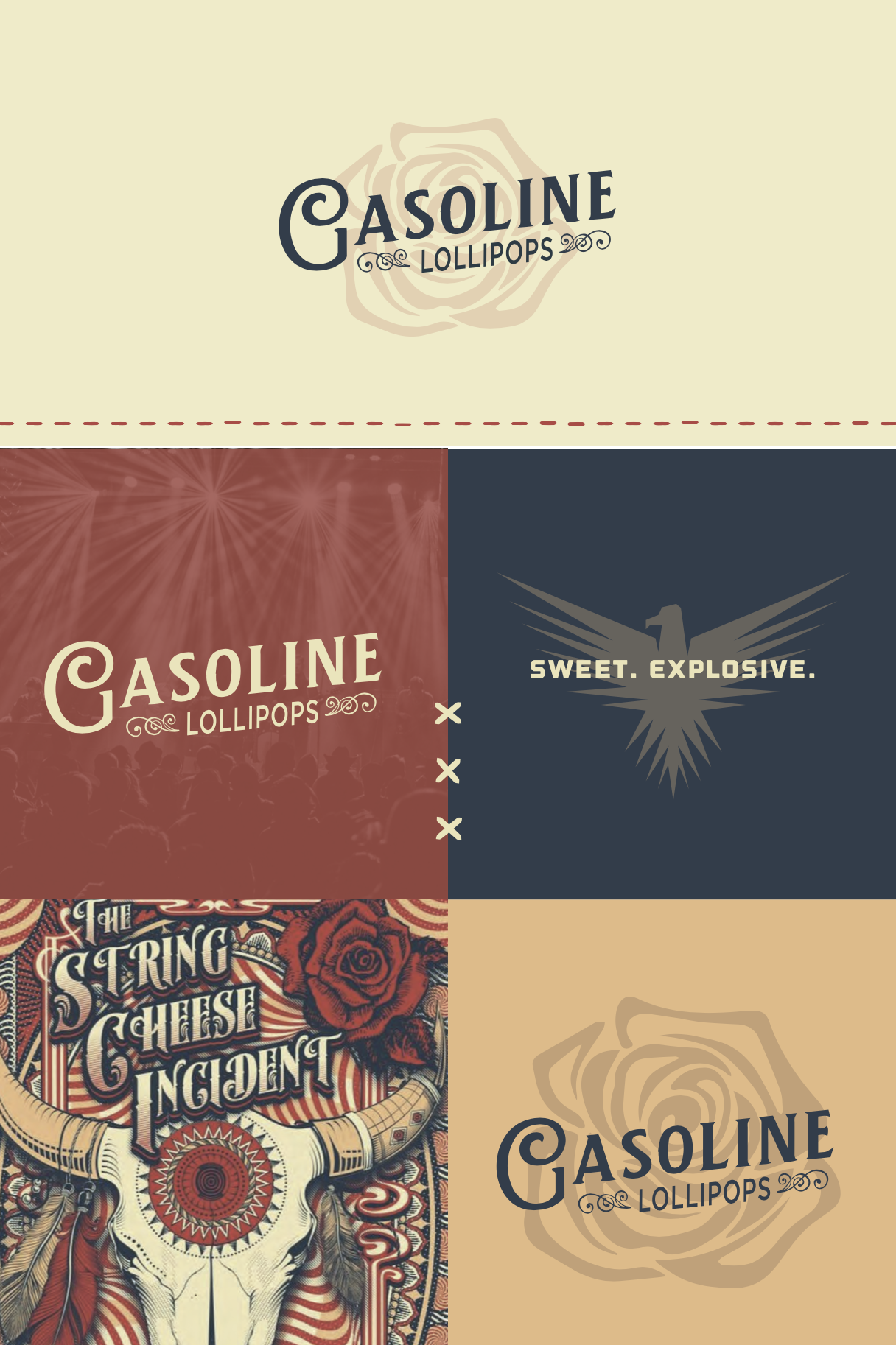
A FLEXIBLE IDENTITY
Event Posters
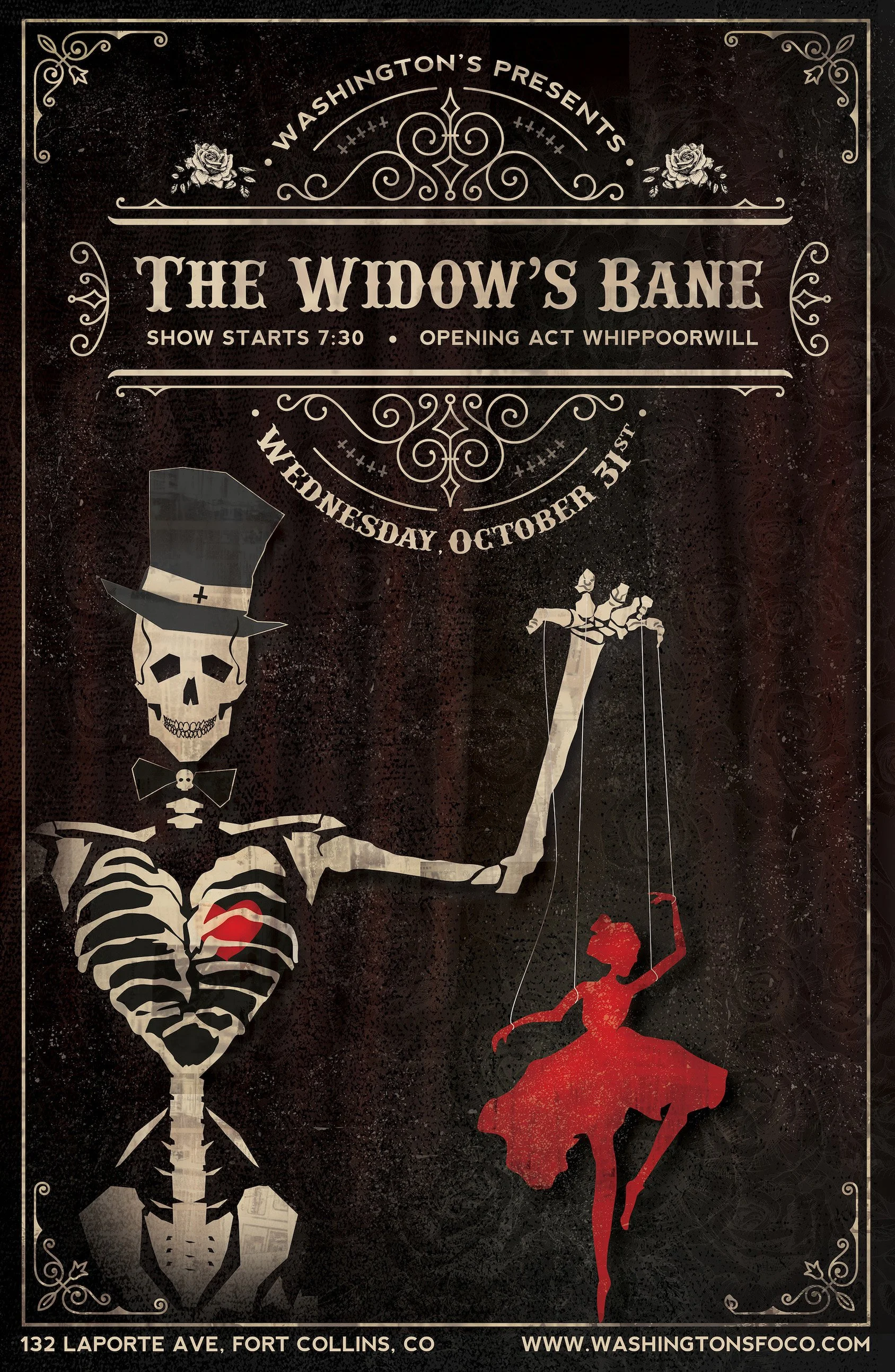
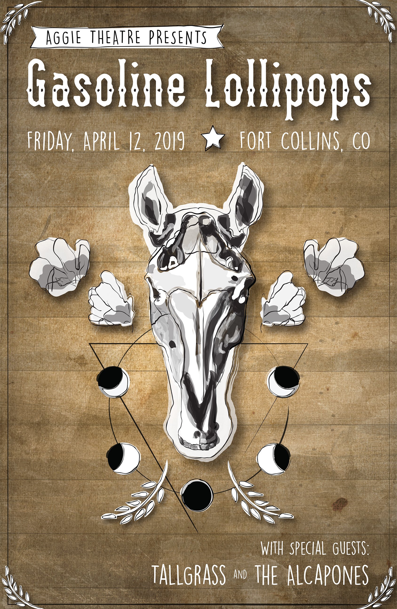
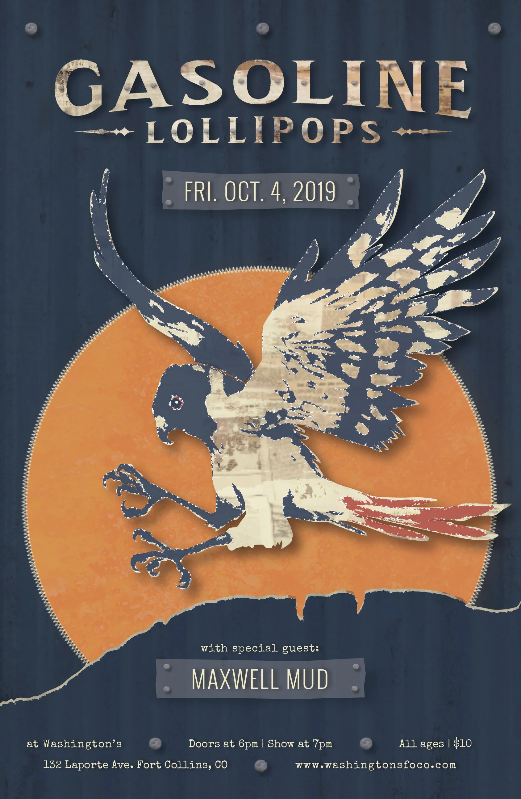
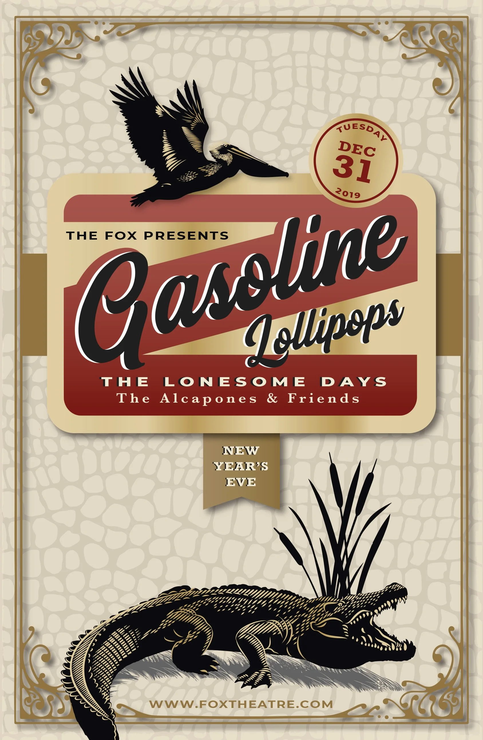
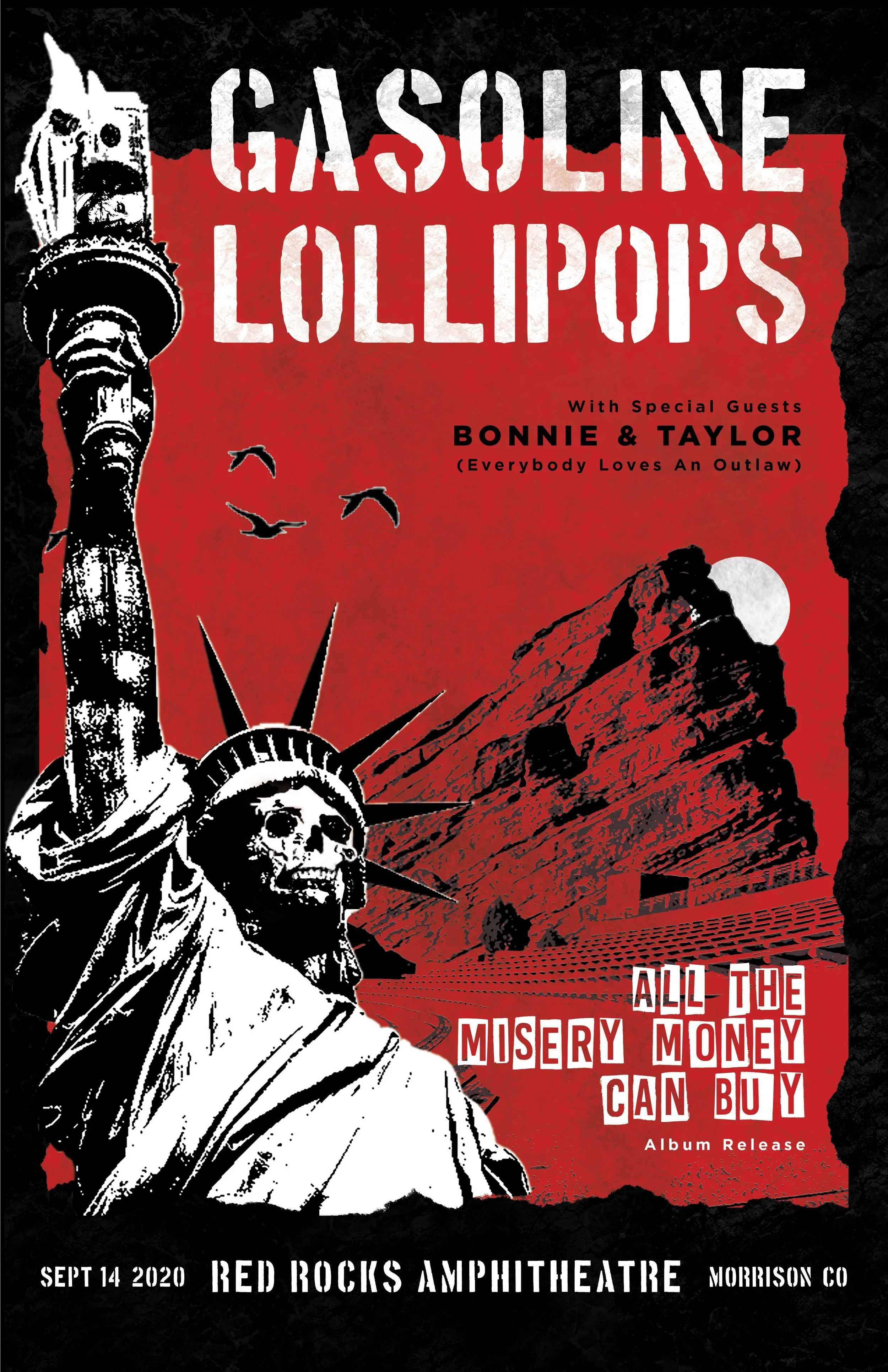
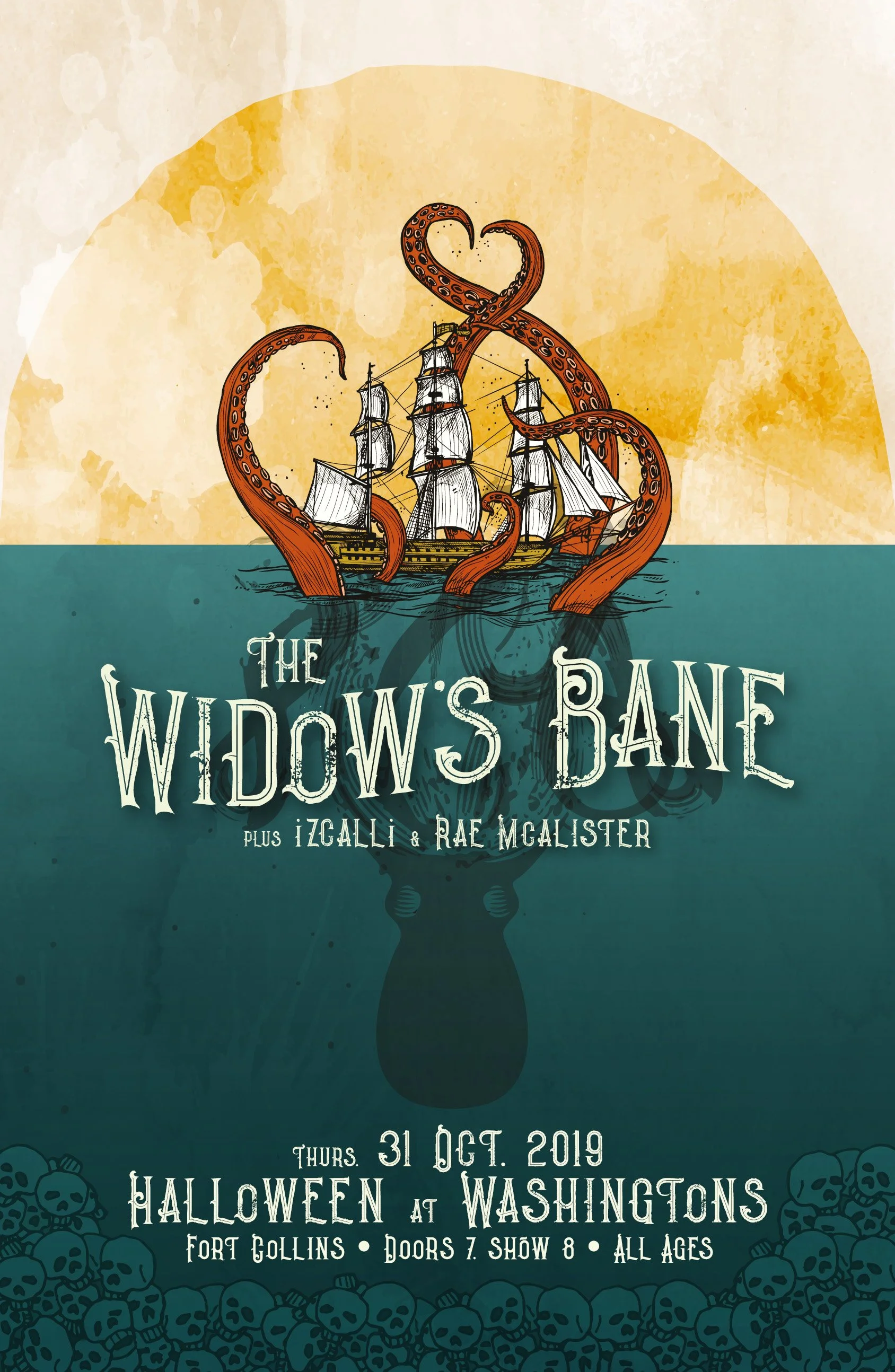
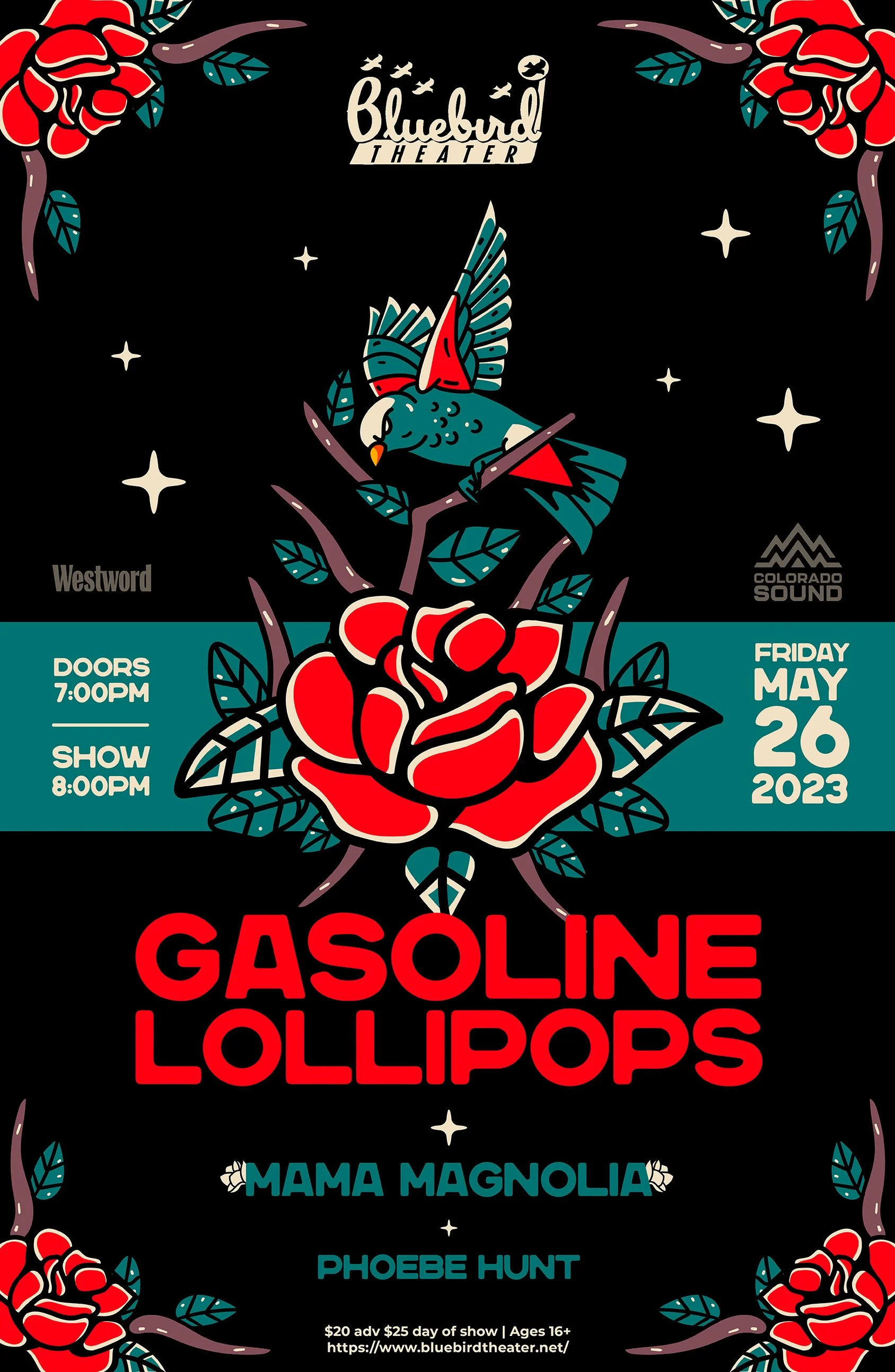
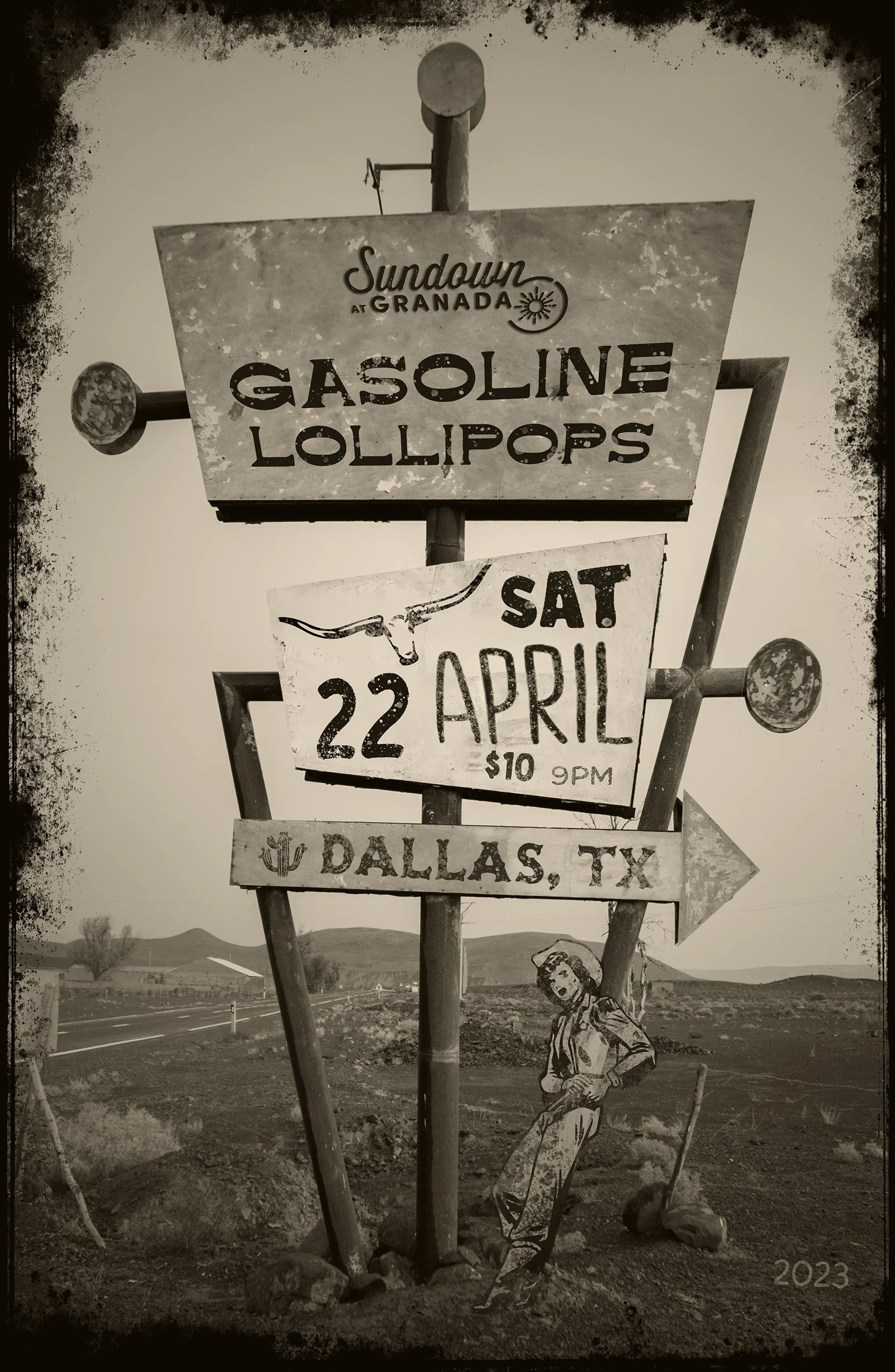
Event posters became an ongoing creative playground throughout my time with the band. Each show offered an opportunity to respond to the venue, lineup, or moment with a distinct concept while drawing from the visual language established for Gasoline Lollipops.
Fittingly, the format that started the relationship remained one of the places where I had the most freedom to experiment.
Album Art & Streaming
Each release became an opportunity to build a distinct visual world around the music, extending from album artwork into streaming and promotional assets.
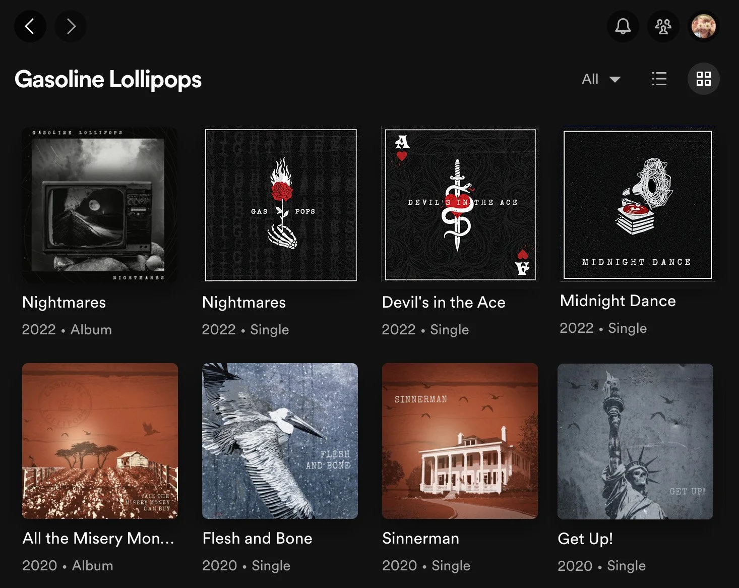
Album artwork across digital music platforms
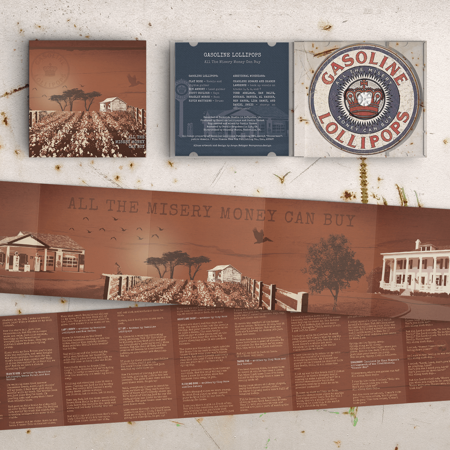
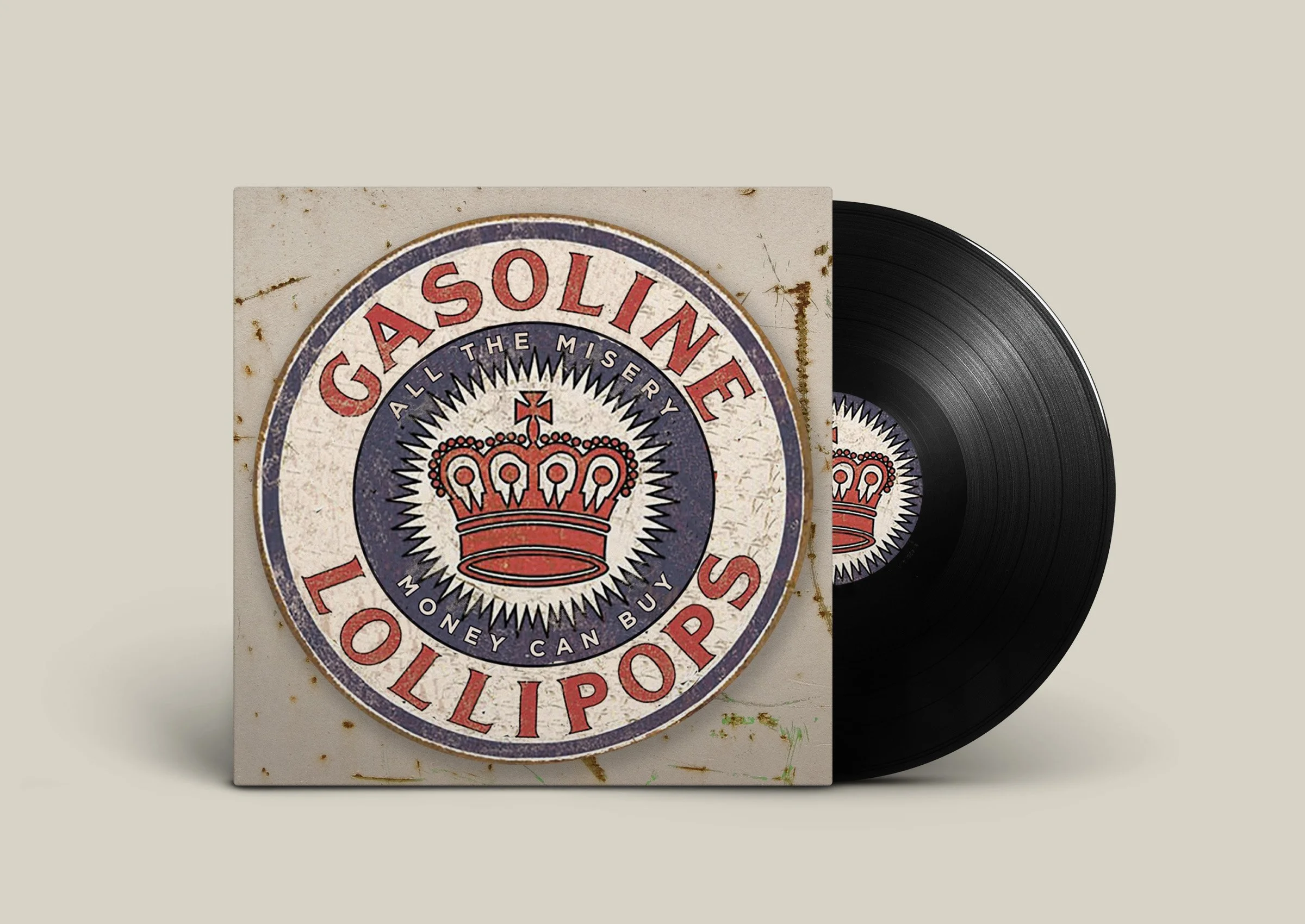
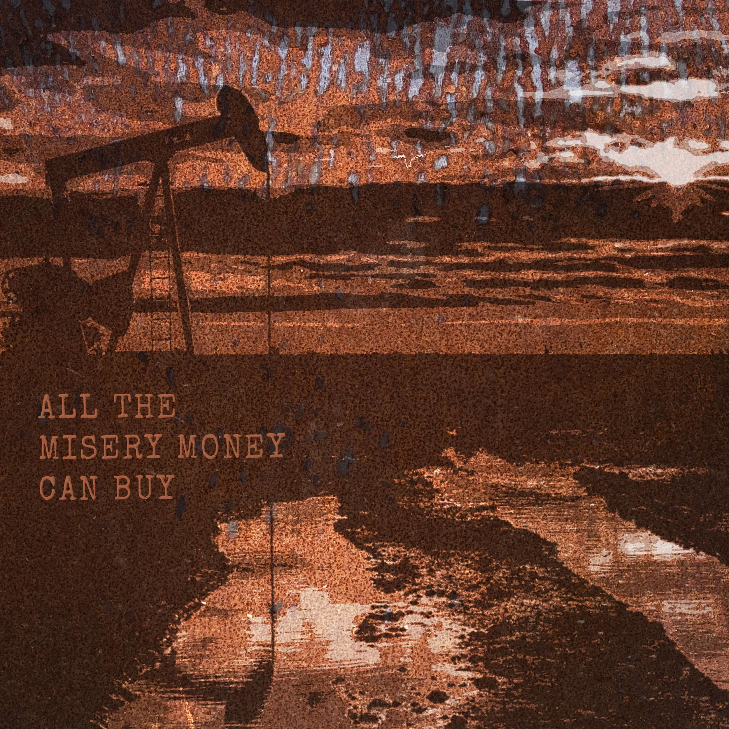
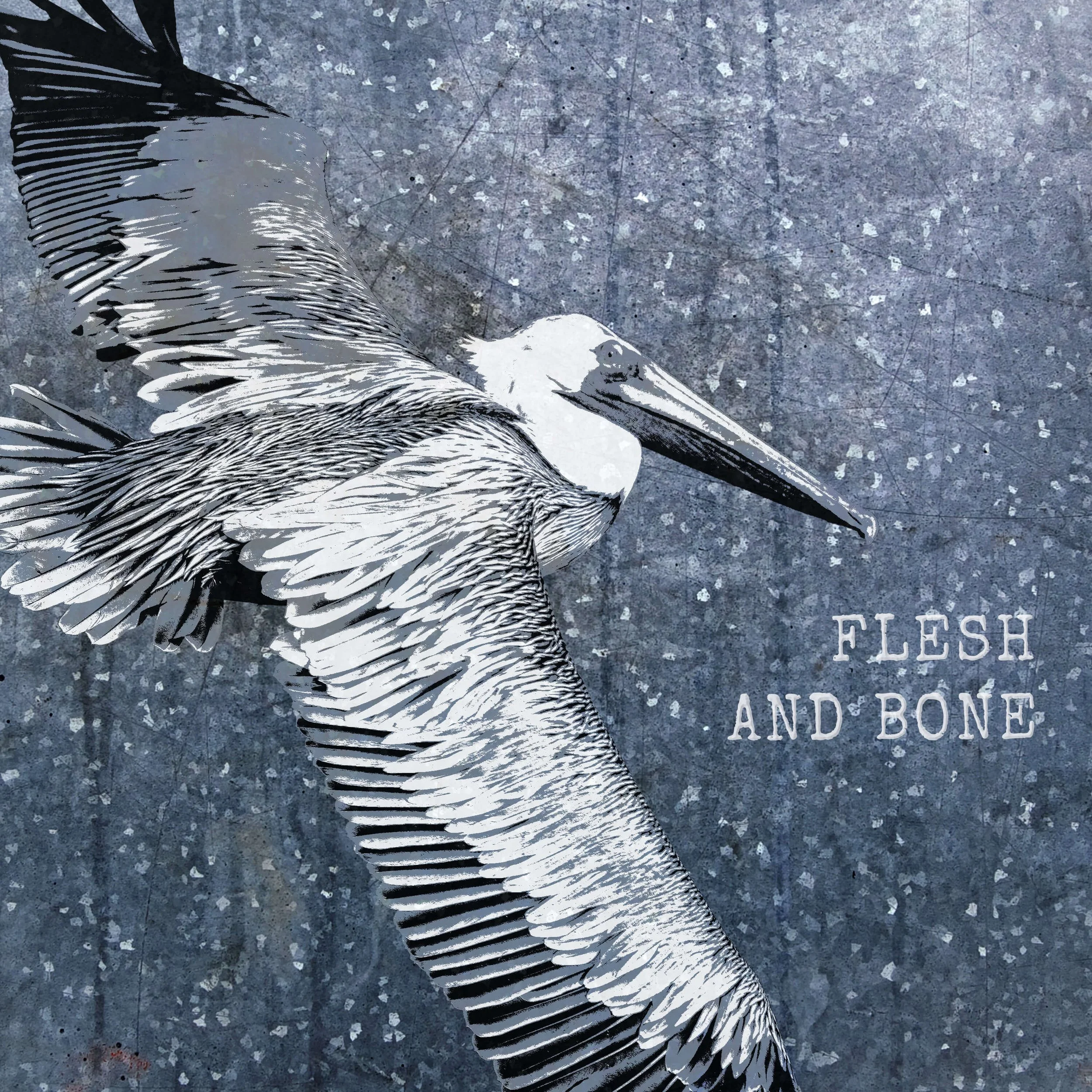
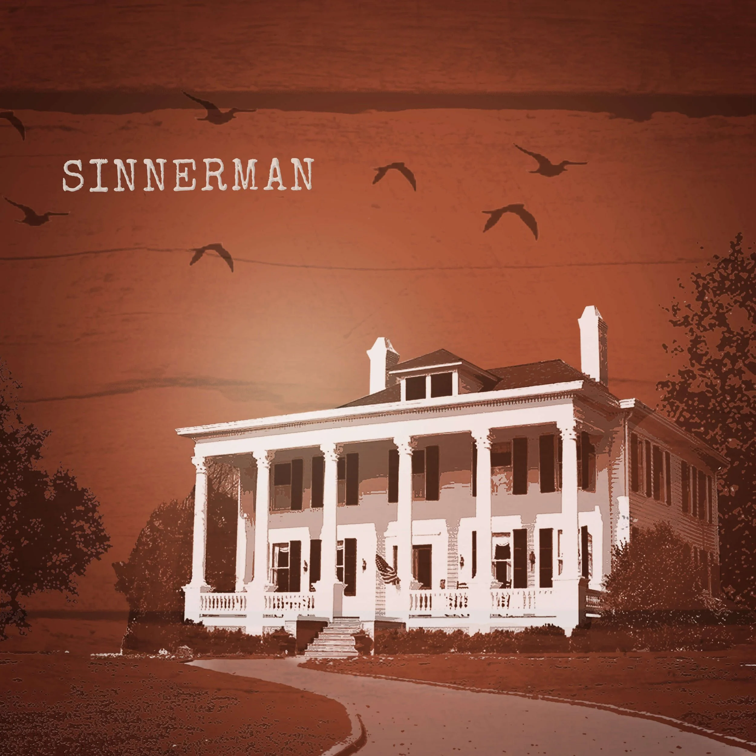
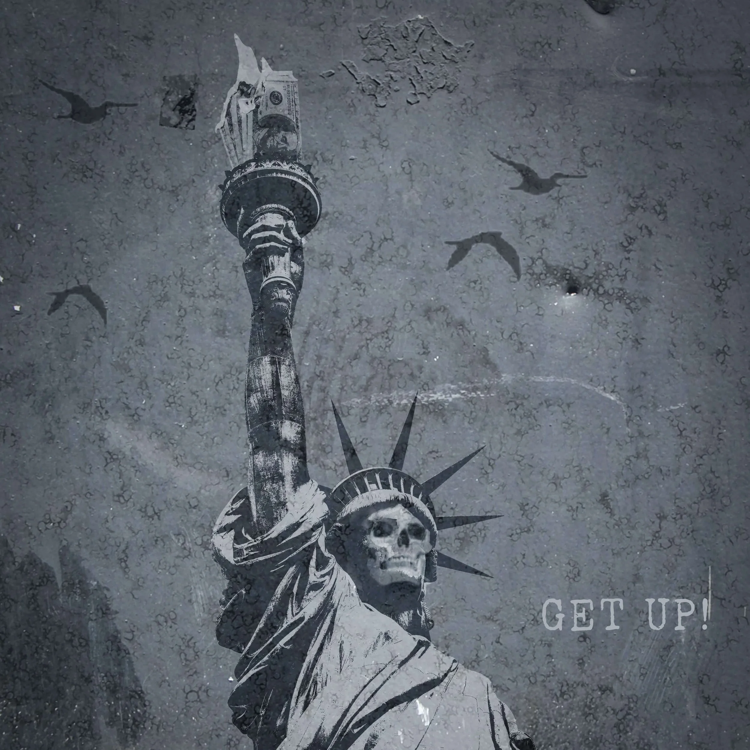
All the Misery Money Can Buy — 2020
For All the Misery Money Can Buy, I developed a weathered Southern visual world built from distressed photography, layered textures, and a muted rust-and-navy palette. The direction extended into Spotify single artwork, giving individual songs their own imagery within the larger release.
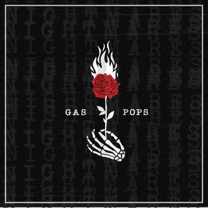
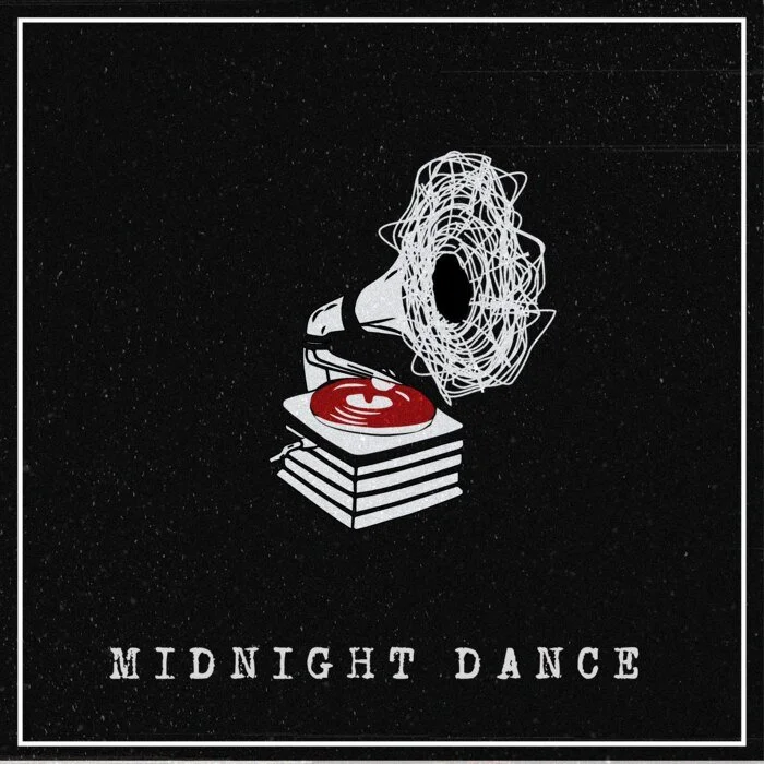
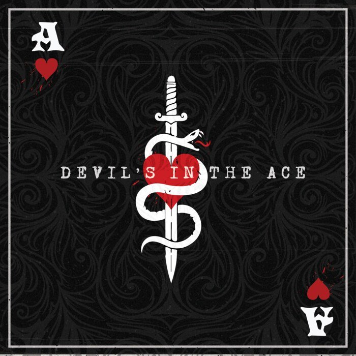
Nightmares — 2022
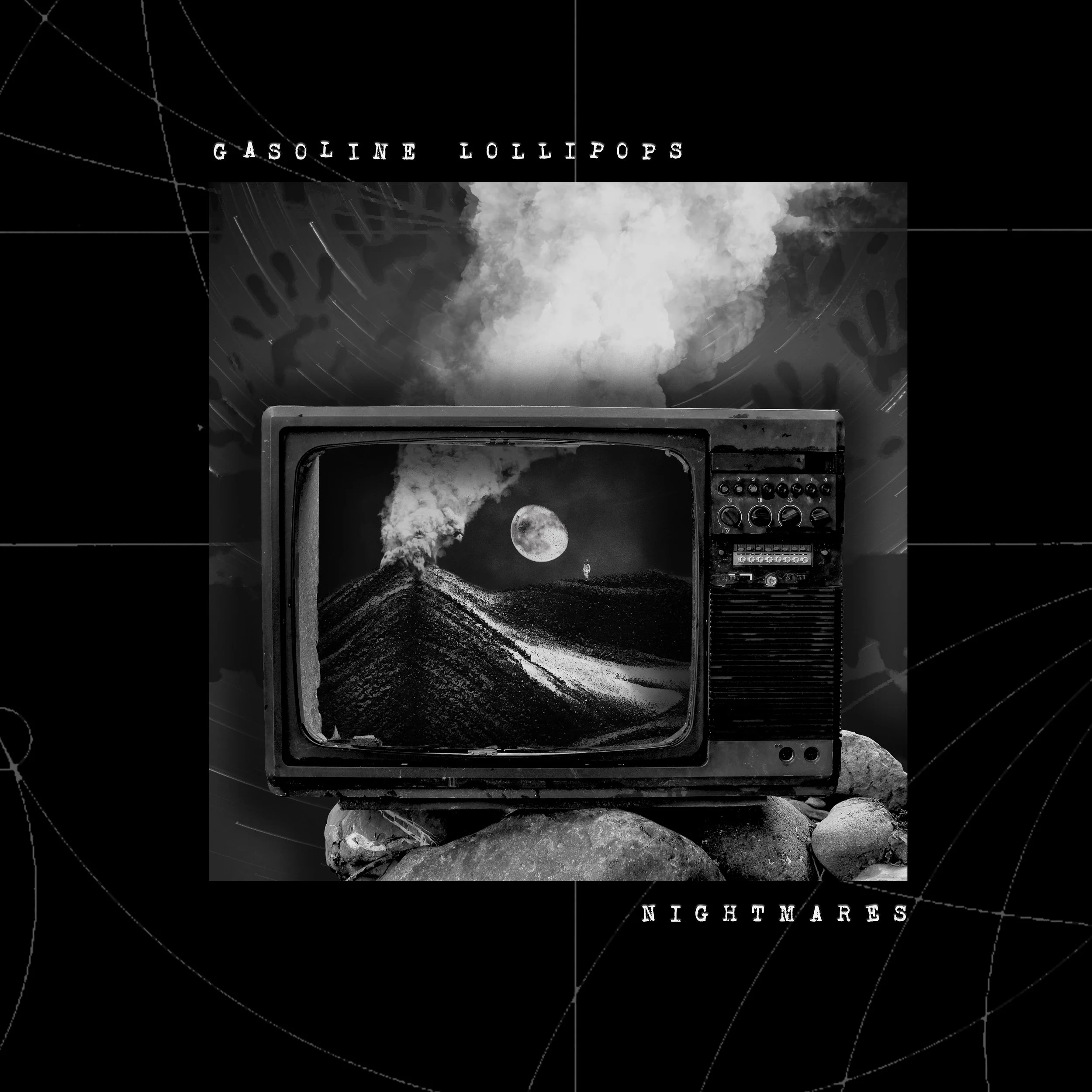
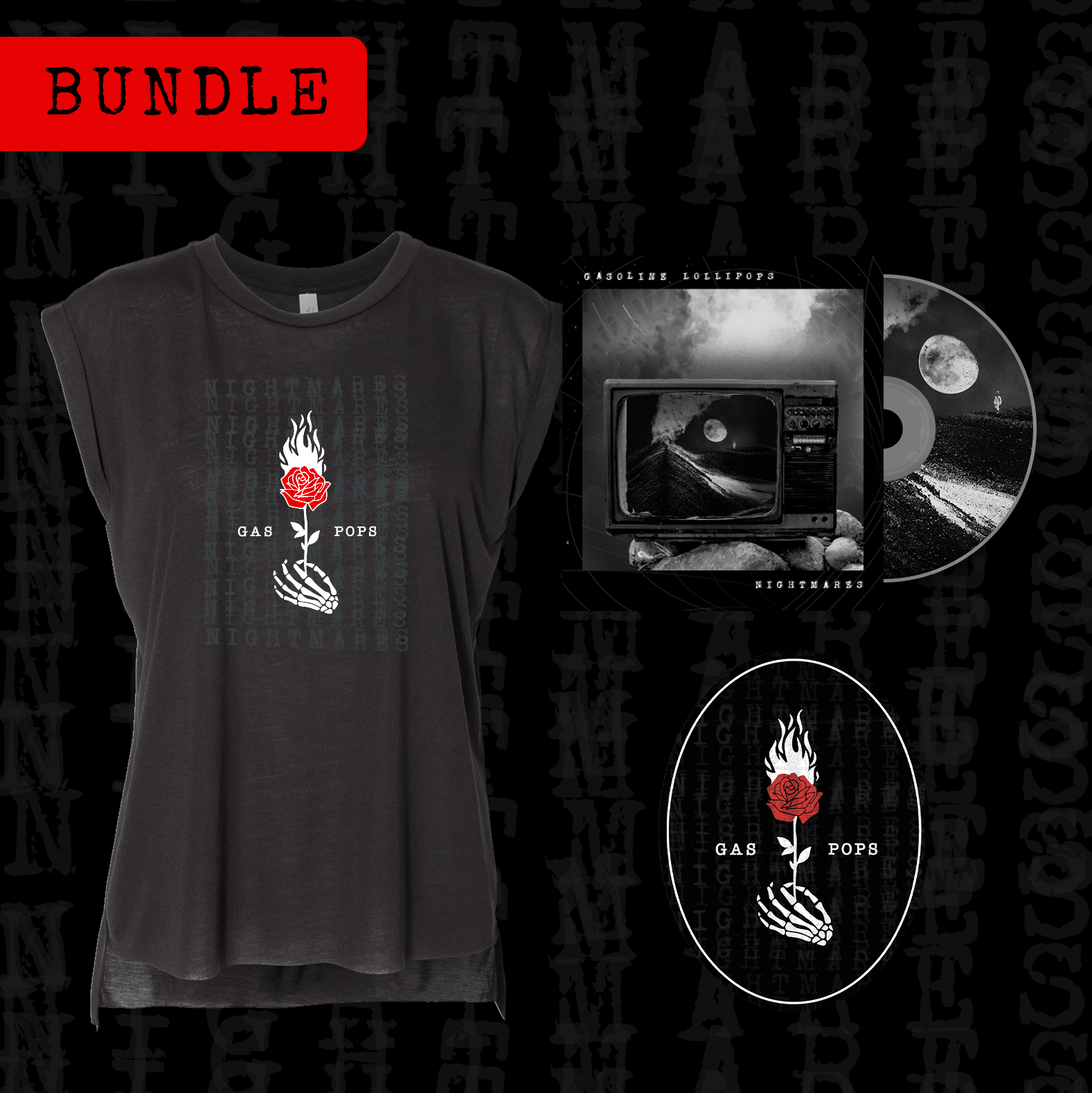
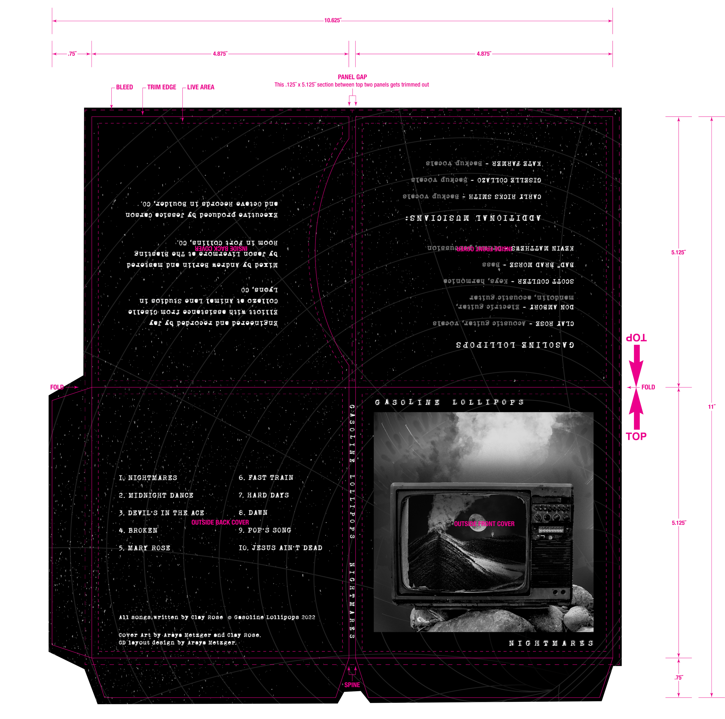
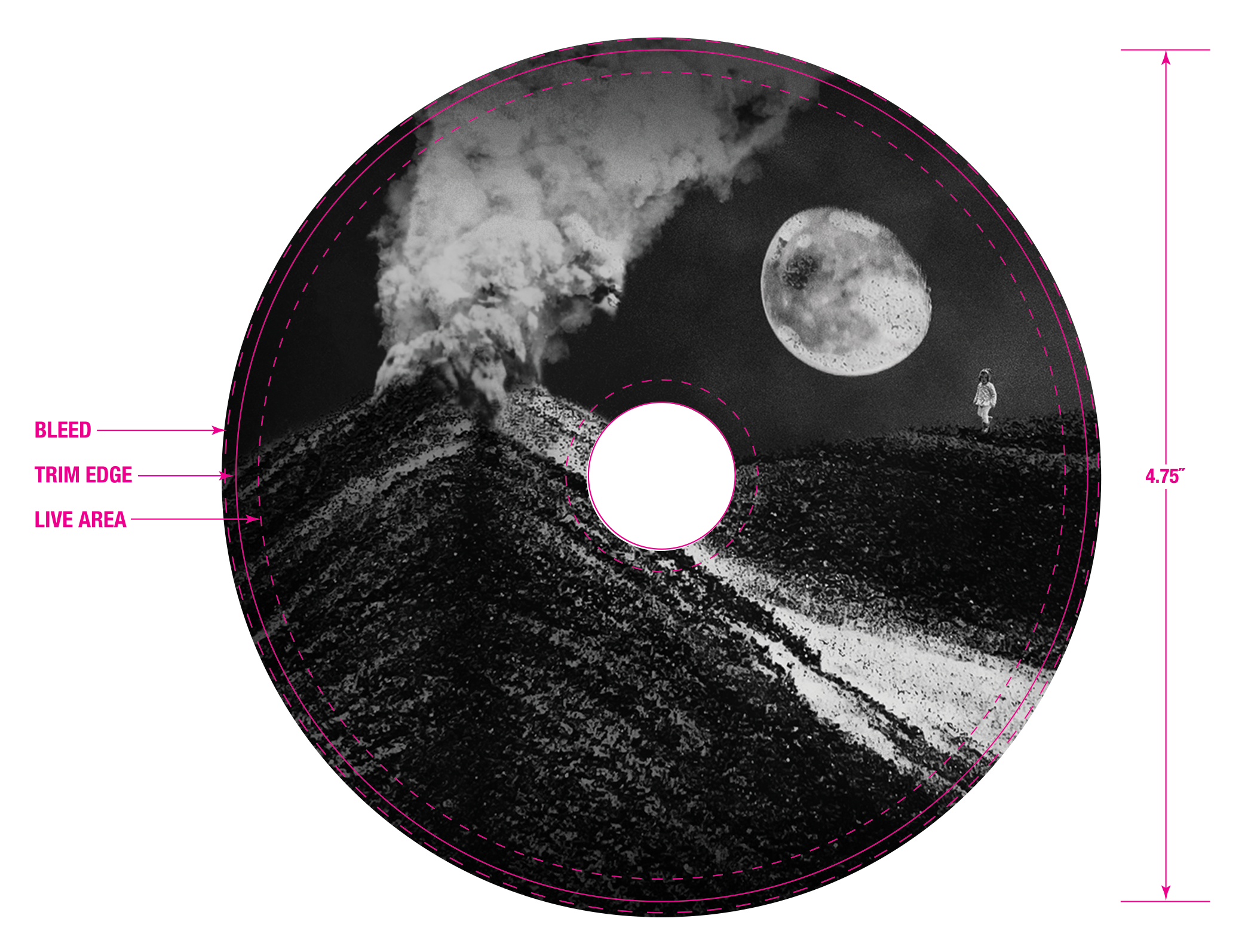
Nightmares called for a dramatic shift. I built the release around stark black-and-white imagery, surreal collage, grain, and controlled hits of red, creating a darker visual world that reflected the tone of the record. The direction carried through the album artwork, merchandise, and Spotify single covers.
LIVE EXPERIENCE
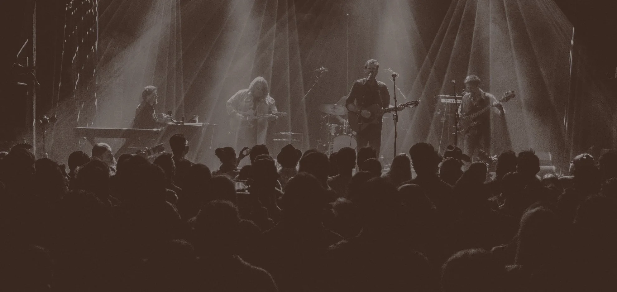
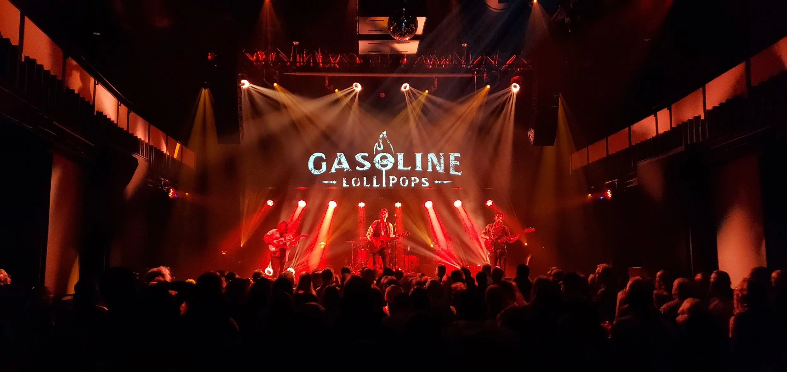
As the band grew, so did the scale of the work. What began on posters and screens eventually moved onto the stage, with the identity becoming part of the live-show environment itself.
Seeing it at that scale closed the loop: an identity built around the music was now part of the experience of hearing it live.
OUT IN THE WORLD
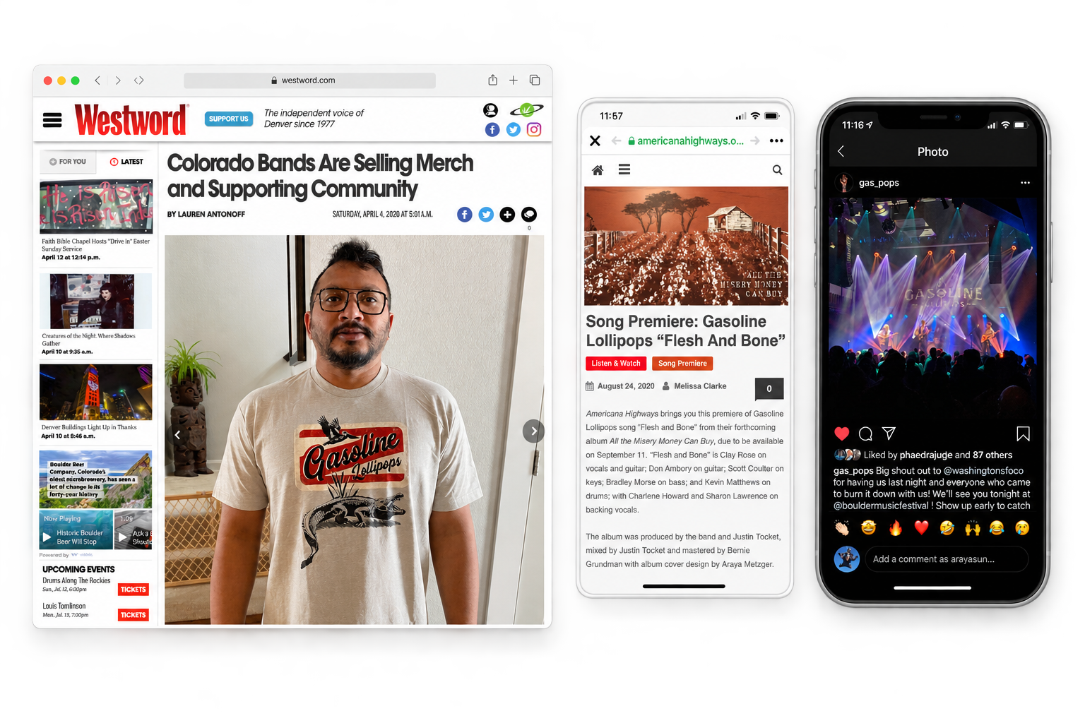
The identity took on a life beyond the pieces I designed, appearing in music press, worn by fans, credited alongside the music, and shared from live shows.
Results
What started with one anonymous poster became a five-year creative partnership.
Over that time, Gasoline Lollipops won Westword's Best Country Artist award and three consecutive Colorado Daily Best Local Band titles, landed a Top 10 spot on Billboard's Spotify chart, and made Pandora's Top 10 Trend Setters list. Merchandise also grew into a meaningful source of revenue for the band.
In 2025, Gasoline Lollipops signed with ALP Recordings for their label debut, Kill the Architect, produced by Steve Berlin of Los Lobos. I didn't design that record, but I shaped the visual identity across the two albums that preceded it, All the Misery Money Can Buy and Nightmares, during a period of significant growth for the band.
The work was never one campaign, album, or website. It was a visual foundation built to grow with the band, across five years of releases, merch, digital experiences, press, and live shows, and still feel unmistakably theirs.
COLLABORATORS: Clay Rose, Donny Ambory, Bradley Morse, Kevin Matthews, and Scott Coulter.