
1.37M impressions in month one, rebuilding VSP's value story
〰️
1.37M impressions in month one, rebuilding VSP's value story 〰️
PRoject
VSP Vision Care's 2025 Workplace Vision Health Report holds original research on how eye health affects workforce productivity. The report came from elsewhere in the org, but it anchored a year-long initiative built across three fronts: A demand gen campaign to get the research seen, a full redesign of the employer experience to give VSP's case a permanent home, and a live presence at SHRM25 to put it in front of thousands of HR leaders directly.
I worked across all three: The visual system for the report's campaign, the redesigned Employer Hub the report now lives inside, and the creative for VSP's SHRM25 and Virtual Retreat presence.
Finding the Opportunity
The underlying research told a story most HR teams hadn't heard: Workforce eye health is getting worse, and vision benefits are undersold relative to their real impact on productivity and healthcare cost.
That finding was substantial enough to carry more than one campaign. It justified investment in three different moments at once: The ongoing content push, the portal an HR leader eventually lands on, and a room full of benefits professionals who could hear the argument live at SHRM25.
The opportunity was treating three separate initiatives as one continuous argument, so the case for vision benefits showed up everywhere an HR leader might be paying attention, across the full year instead of a single push.
The 2025 Workplace Vision Health Report
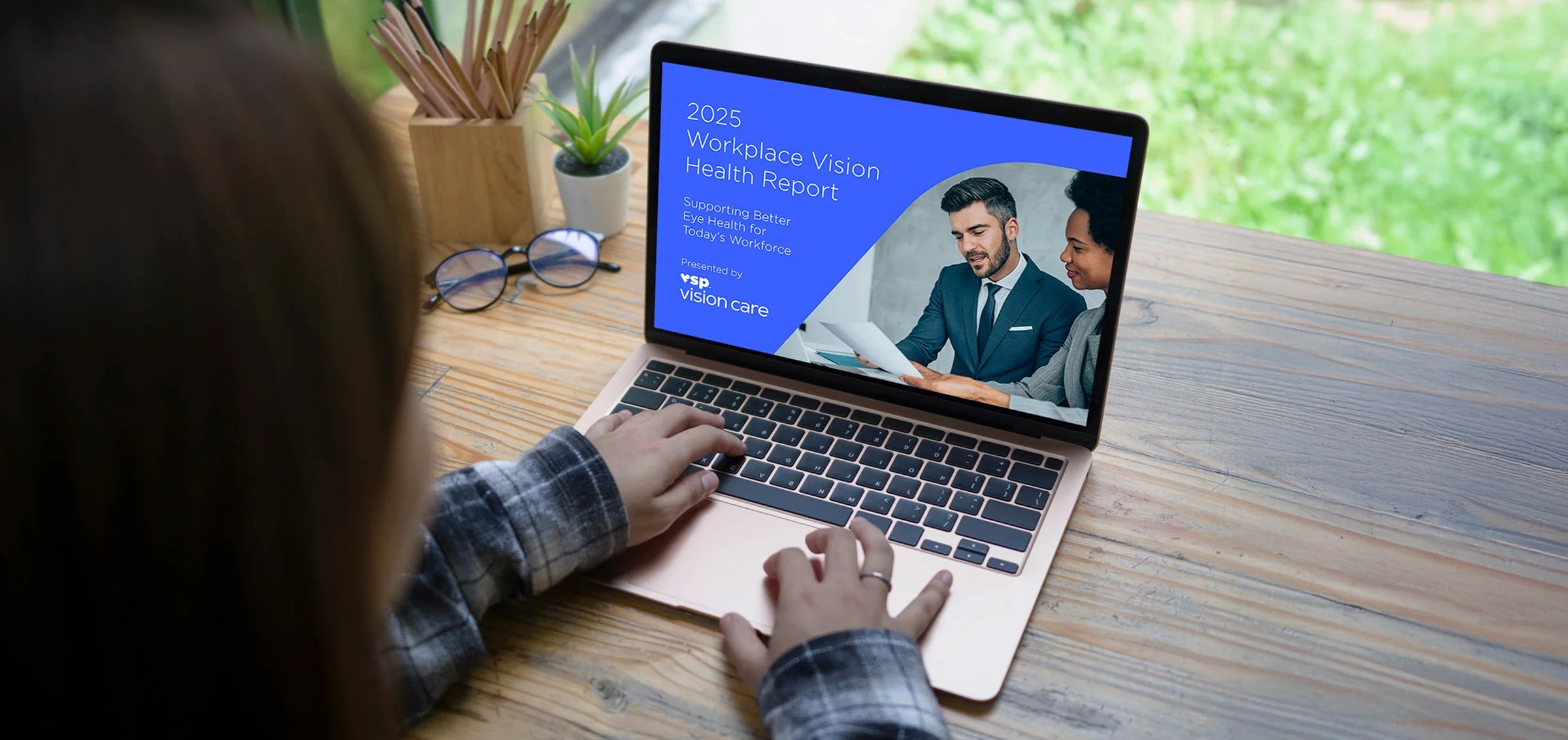
"Supporting Better Eye Health for Today's Workforce." The report itself is the campaign's source document. Everything else in this case study exists to get someone to open it.
Building a Flexible Design System
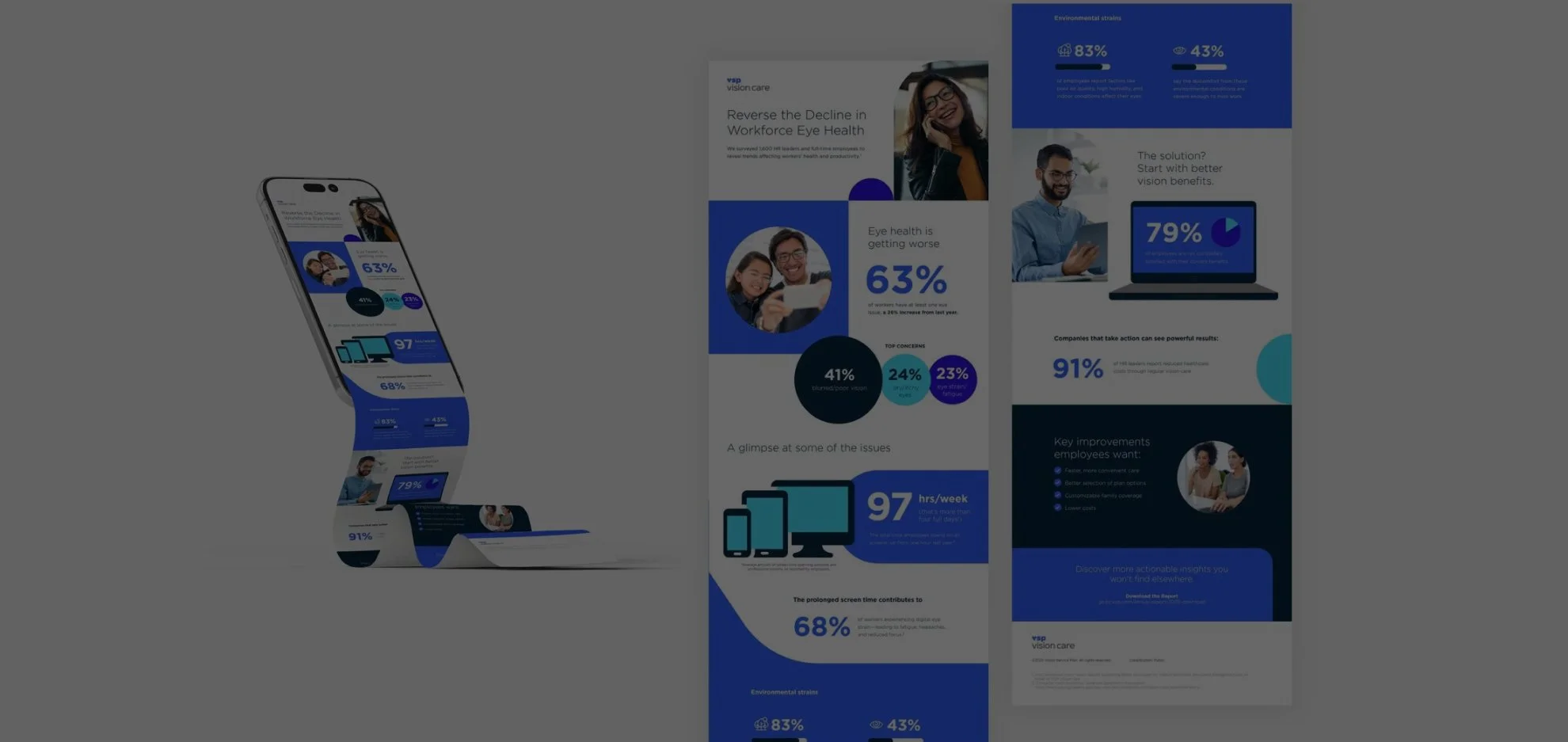
The report covers survey data across three concerns: Eye health decline, screen time, and environmental strain. The system needed to make numbers the hero without turning the page into a wall of stats, so I leaned on large-scale numerals, color-coded circular data callouts, and short supporting copy. Each stat reads in isolation or as part of the whole.
The same modular approach carried into layout. Full-bleed color blocks, circular photo crops, and a consistent icon set gave every format a shared visual grammar, even as the content and format changed.
Employer Awareness Landing Pages
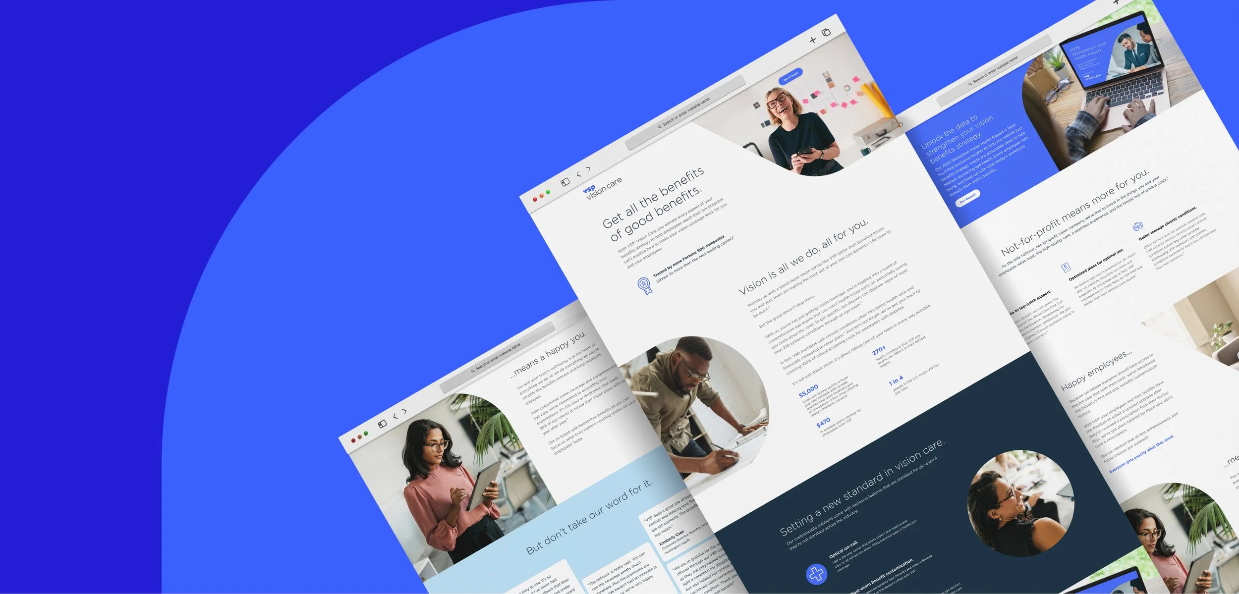
One of nine blogs I designed for this campaign, each also built out in a responsive mobile layout for developer handoff.
White Papers
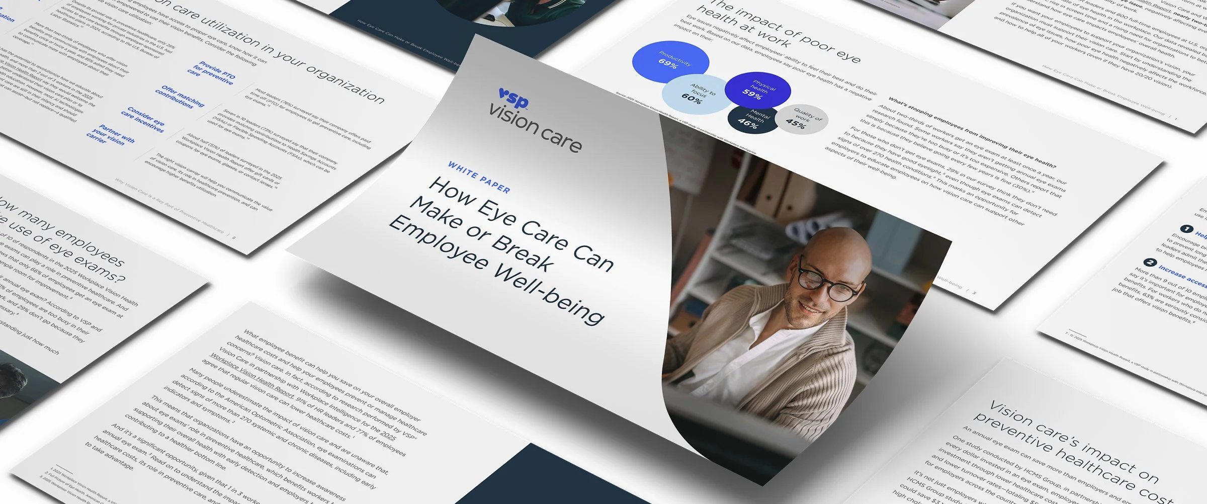
"How Eye Care Can Make or Break Employee Well-being" is one of several companion white papers built for this campaign, unpacking the report's productivity and healthcare-cost data for readers who want the deeper argument, not just the headline stat.
Infographic
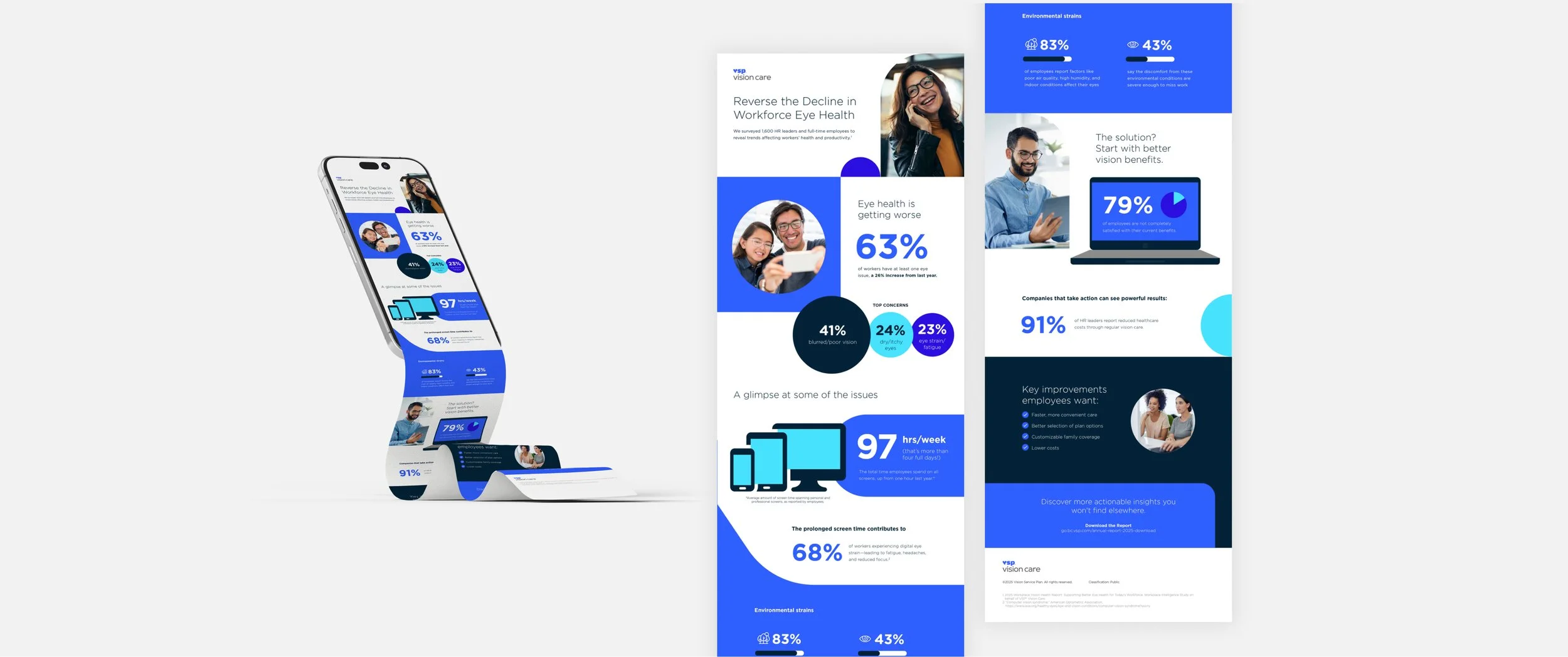
This piece leads two lives: A scrollable mobile version and a full print-and share-ready layout, covering eye health decline, screen time, and environmental strain in a format made to be shared without anyone opening the report.
Blog + Social Amplification
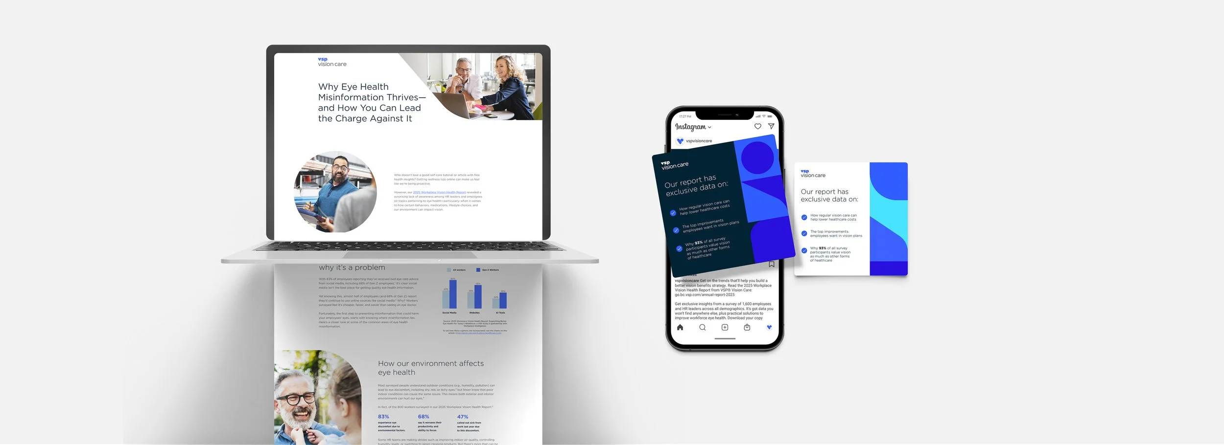
LinkedIn single-image ads targeting HR professionals, one of multiple entry points designed to pull readers into the report and the campaign's core argument.
Portal Redesign
Research & Strategy
A competitive audit and interviews with employer and broker personas revealed the same problem: VSP's old portal felt transactional and hard to navigate. HR leaders wanted proof the investment worked. Brokers wanted a selling tool, not just an admin dashboard. The constraint was real. The portal had to work within their existing platform's capabilities. Instead of fighting those limits, I built a system where hierarchy, typography, and color carried the weight. Employer size became the organizing principle. Every visitor got a clearer path to what mattered.
Scope of the Redesign
The old portal was four pages doing one job: house a login and a document library. The Employer Hub is fifteen, each with a stated purpose. Three size-specific entry points, a plans library, a resources hub, and the report campaign's own landing page folded directly into the system, so the campaign and portal redesign now point at each other.
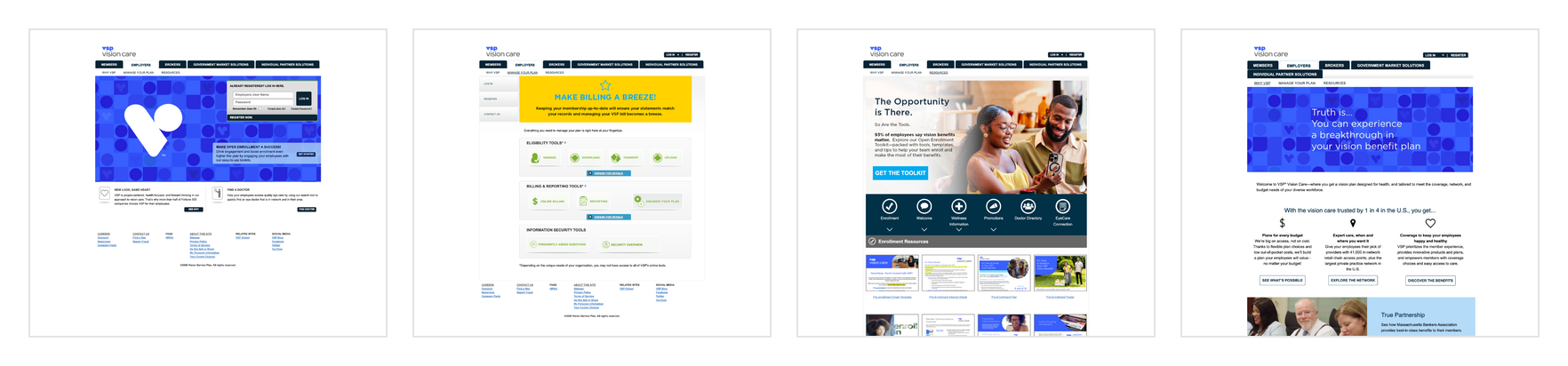
BEFORE

AFTER
Login — Before & After
The old login lived on its own dedicated homepage. In the redesign, login moves into a modal, triggered from a single button in the Employers homepage nav, so the marketing content underneath stays reachable instead of getting replaced by a login form.
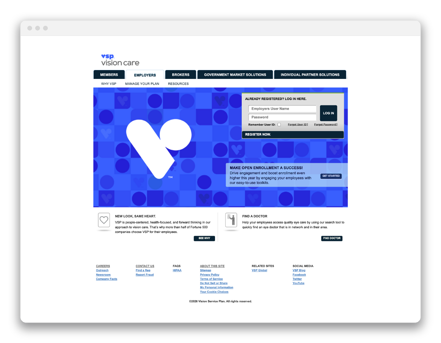
BEFORE
Login box competes with a decorative pattern for attention in the hero.
No path for a visitor who isn't ready to log in yet.
Five-tab nav with no visual hierarchy between audiences.
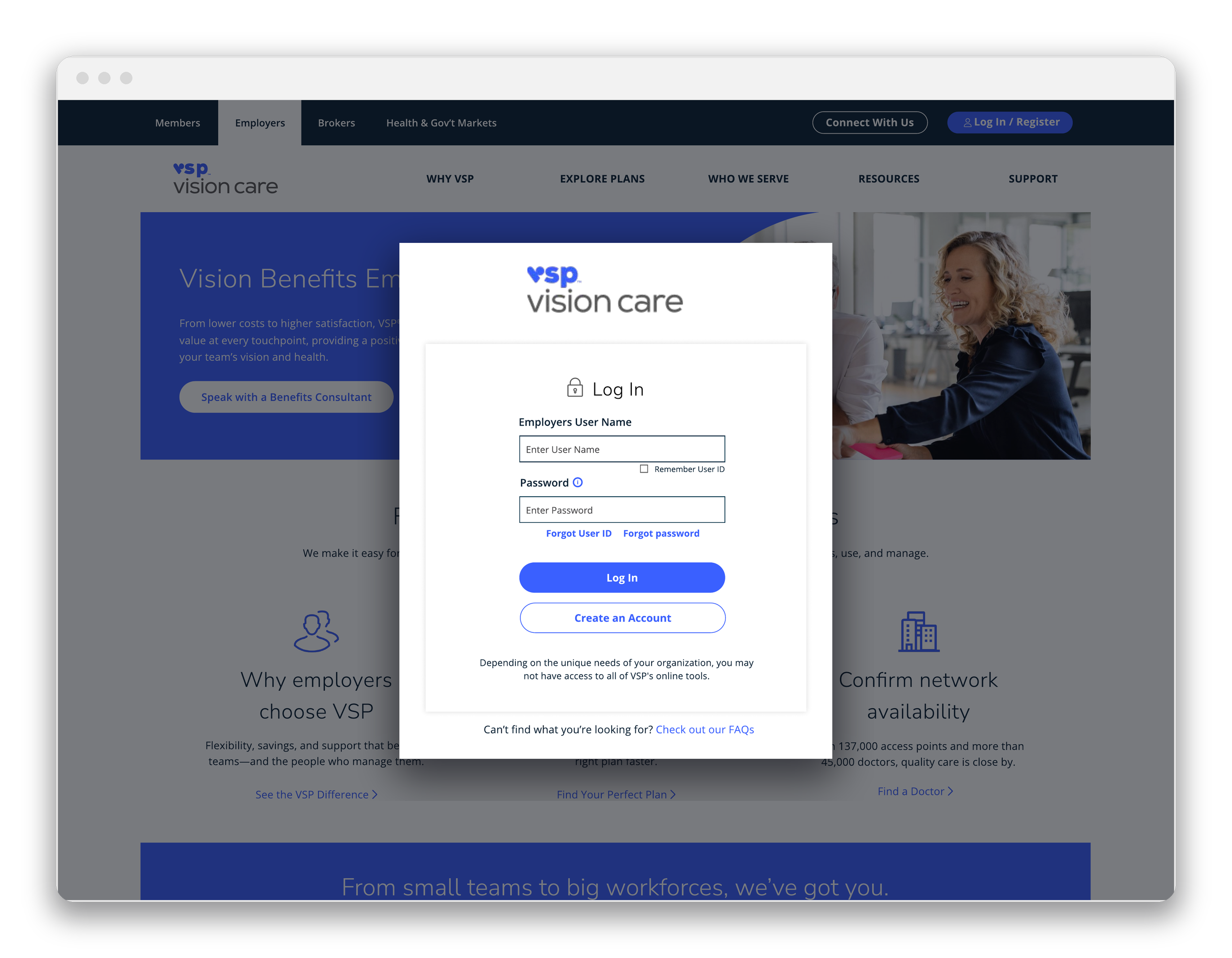
AFTER
Login is a modal launched from one nav button, not the whole page.
"Create an Account" sits beside "Log In" as an equal option, not an afterthought.
"Check out our FAQs" gives an unsure visitor a way forward without a support ticket.
Value Proposition — Before & After
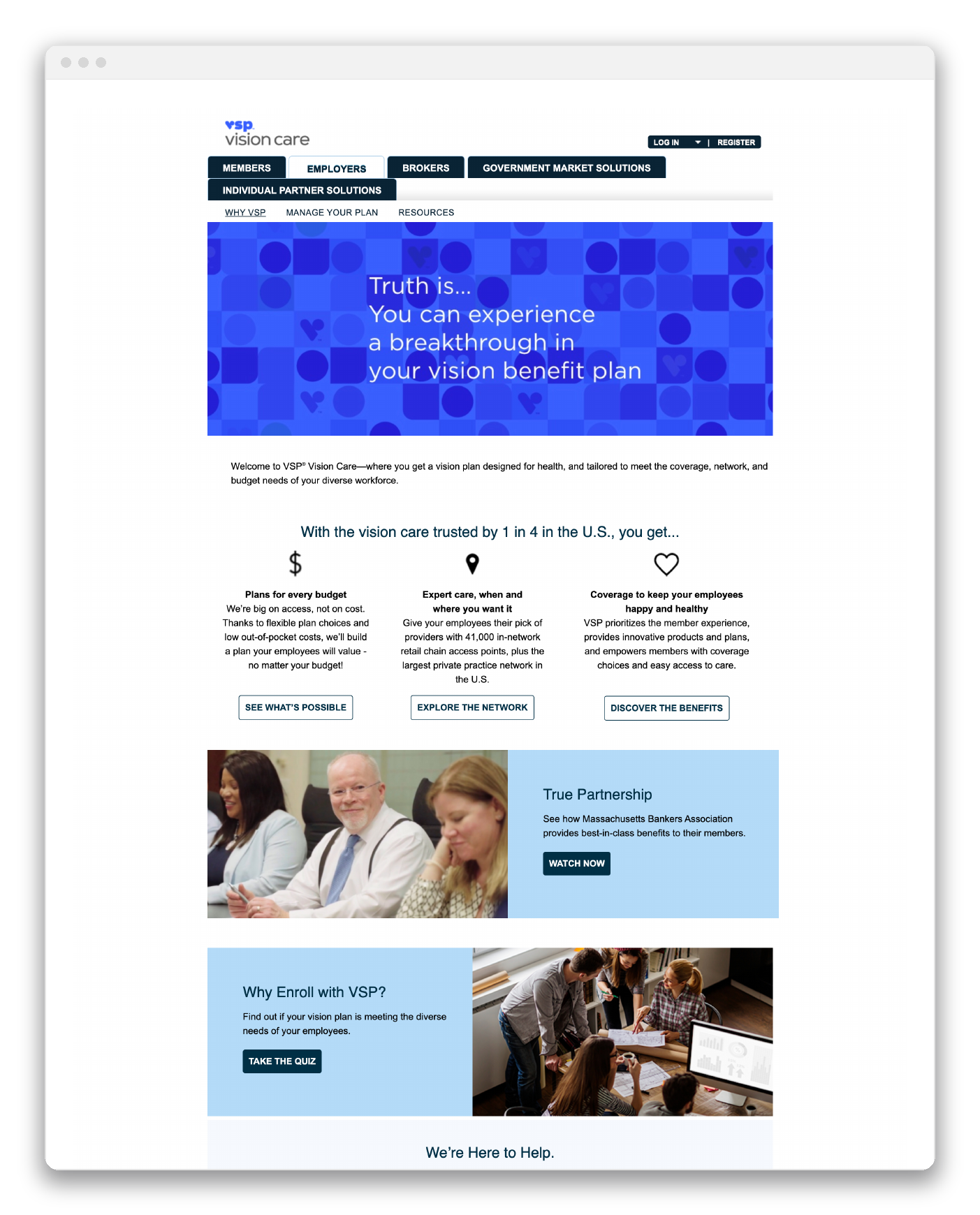
BEFORE
"Truth is... you can experience a breakthrough" leads with a slogan, not a benefit.
Claims like "plans for every budget" carry no numbers behind them.
A busy geometric pattern sits directly behind the hero copy.
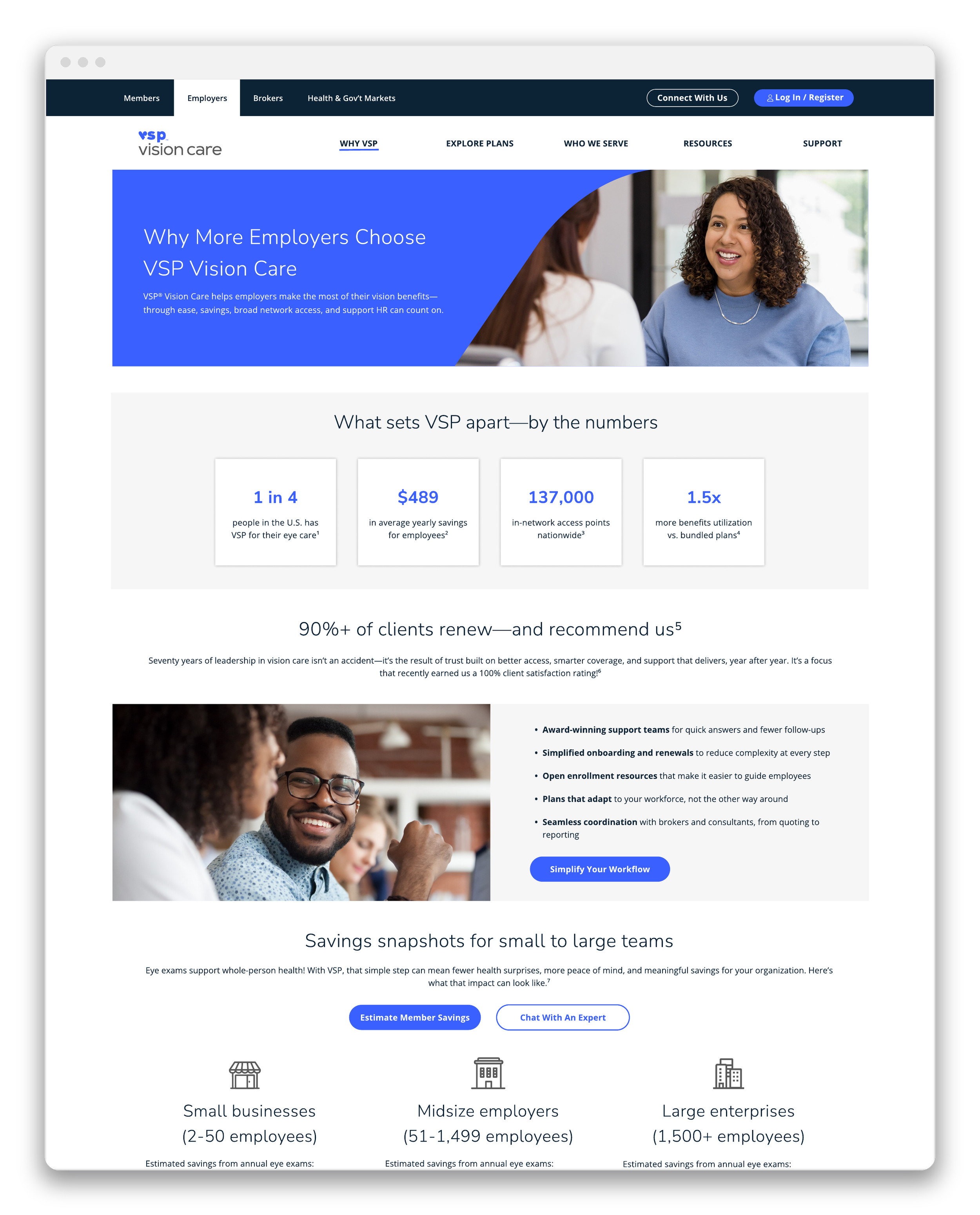
AFTER
Four stat cards, $489 average savings, 137,000 access points, replace claims with numbers.
Savings break out by employer size instead of one generic pitch.
Named, titled testimonials replace the old anonymous photo block.
Admin Tools — Before & After
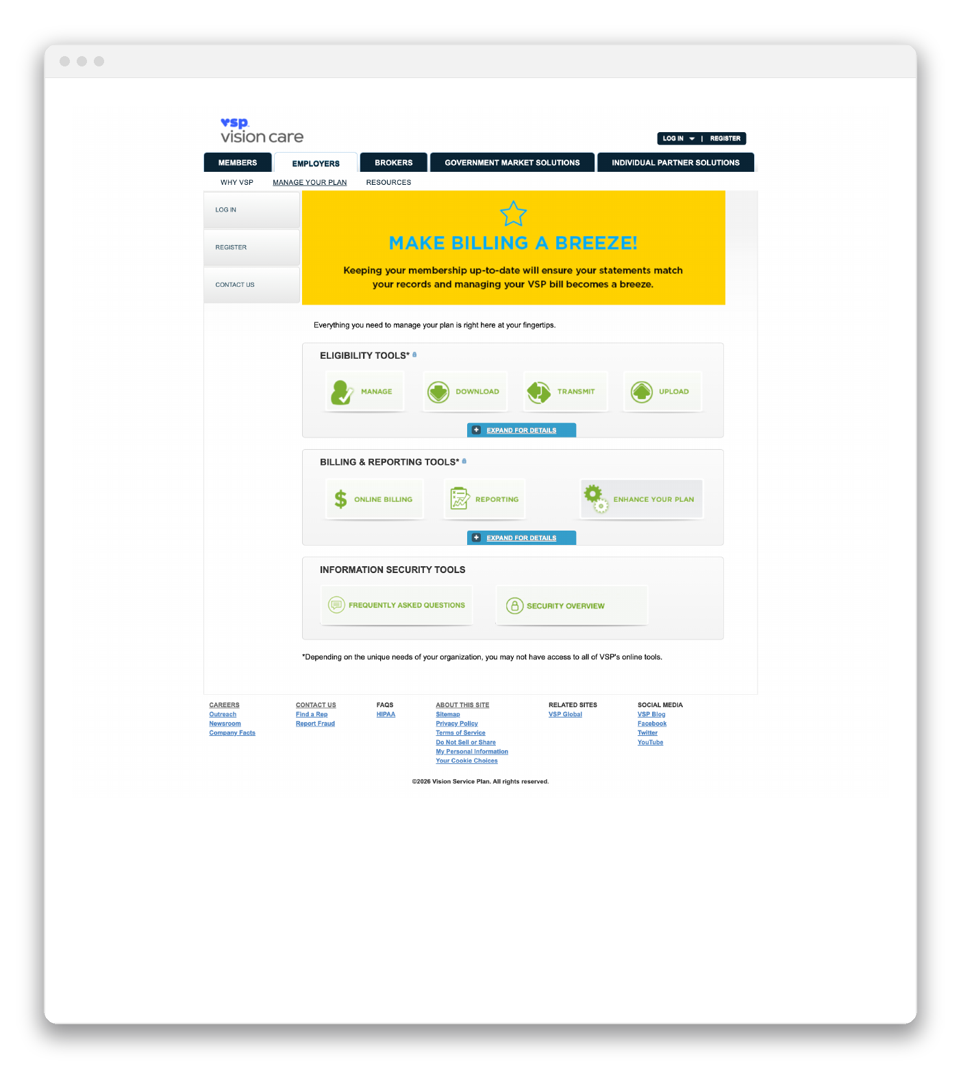
BEFORE
Nine tools sit as equal-weight icon tiles, with no priority between them.
A yellow "Make Billing a Breeze!" banner clashes with the site's blue system.
"Expand for Details" buttons hide what a tool actually does behind an extra click.
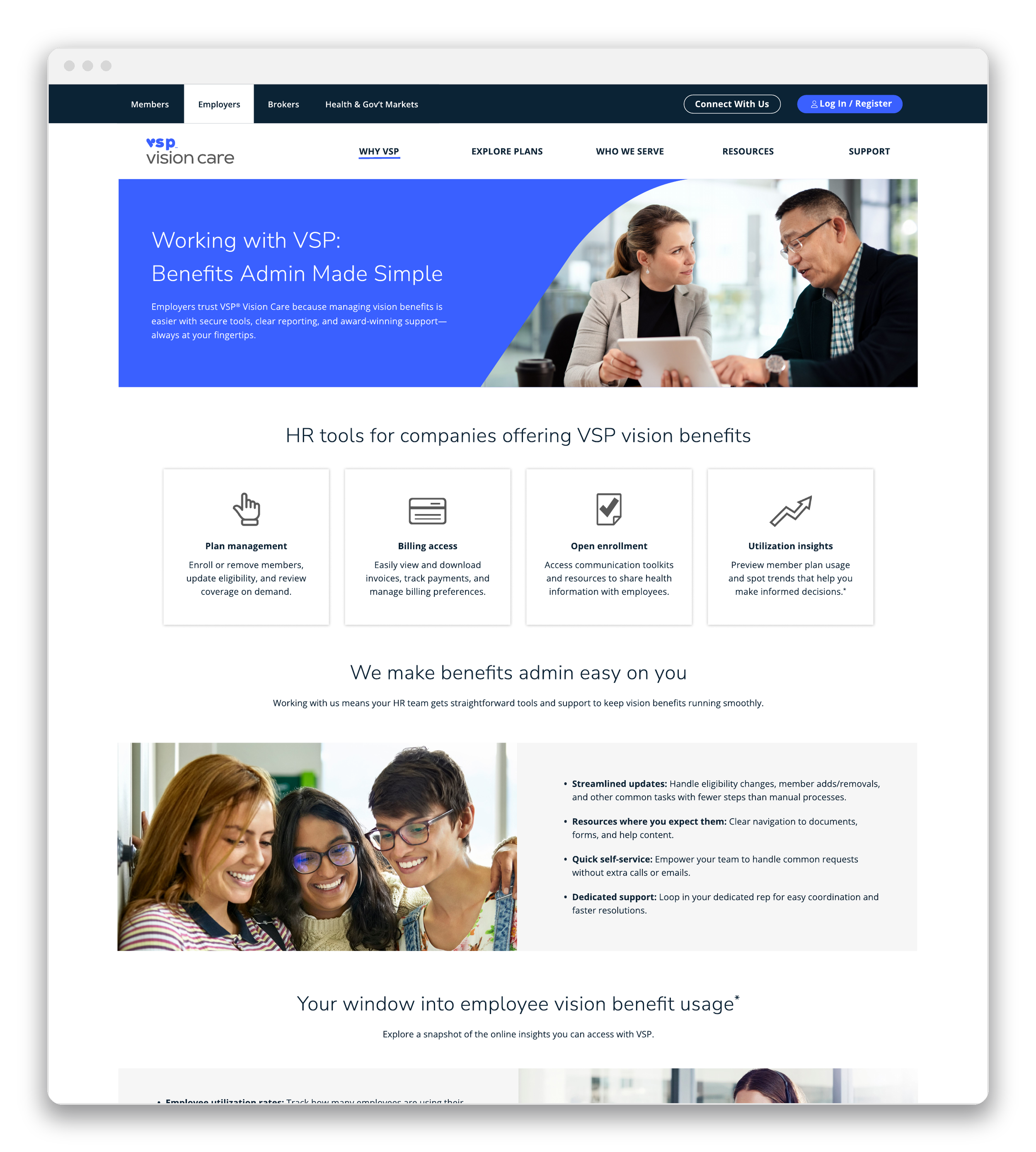
AFTER
Four tools, each with a one-line job instead of a bare label.
Bulleted benefits explain why a tool matters, not just what it's called.
A dedicated utilization-insights module gives HR a reason to come back.
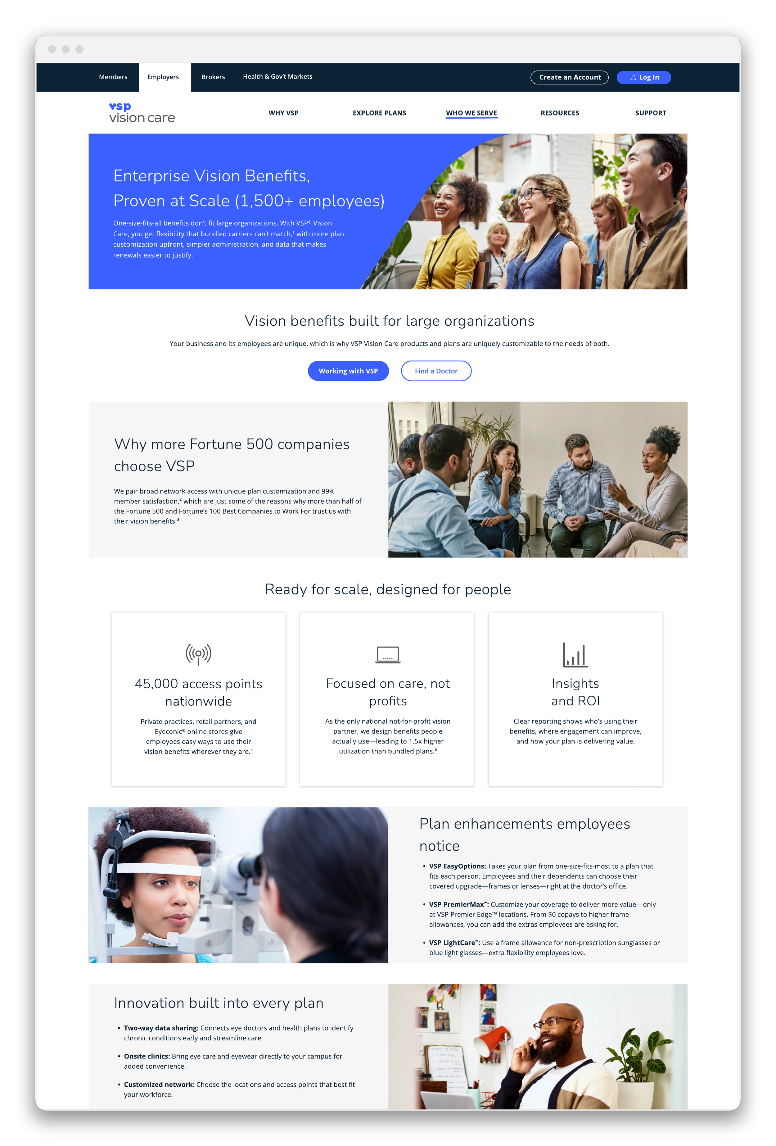
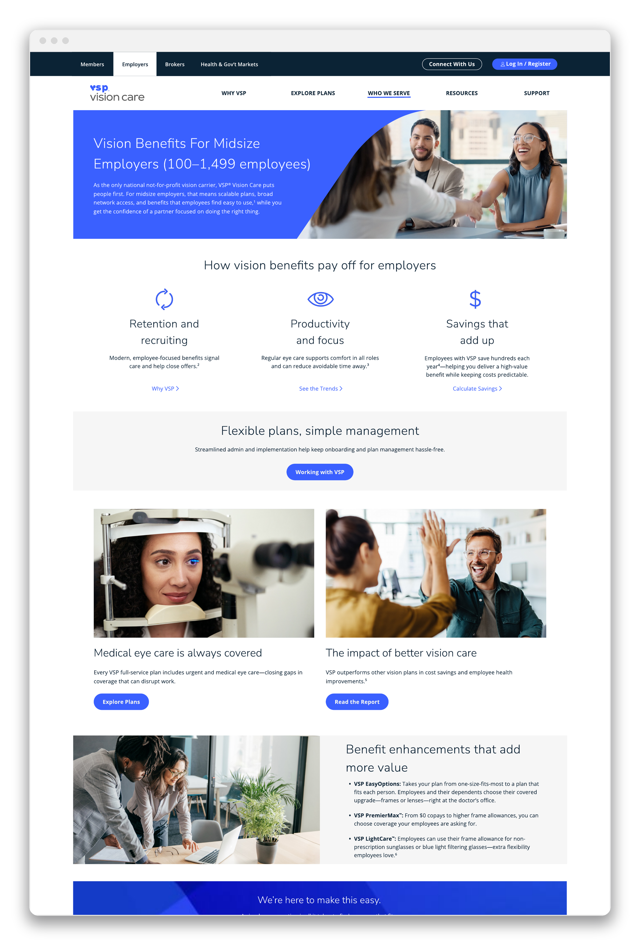
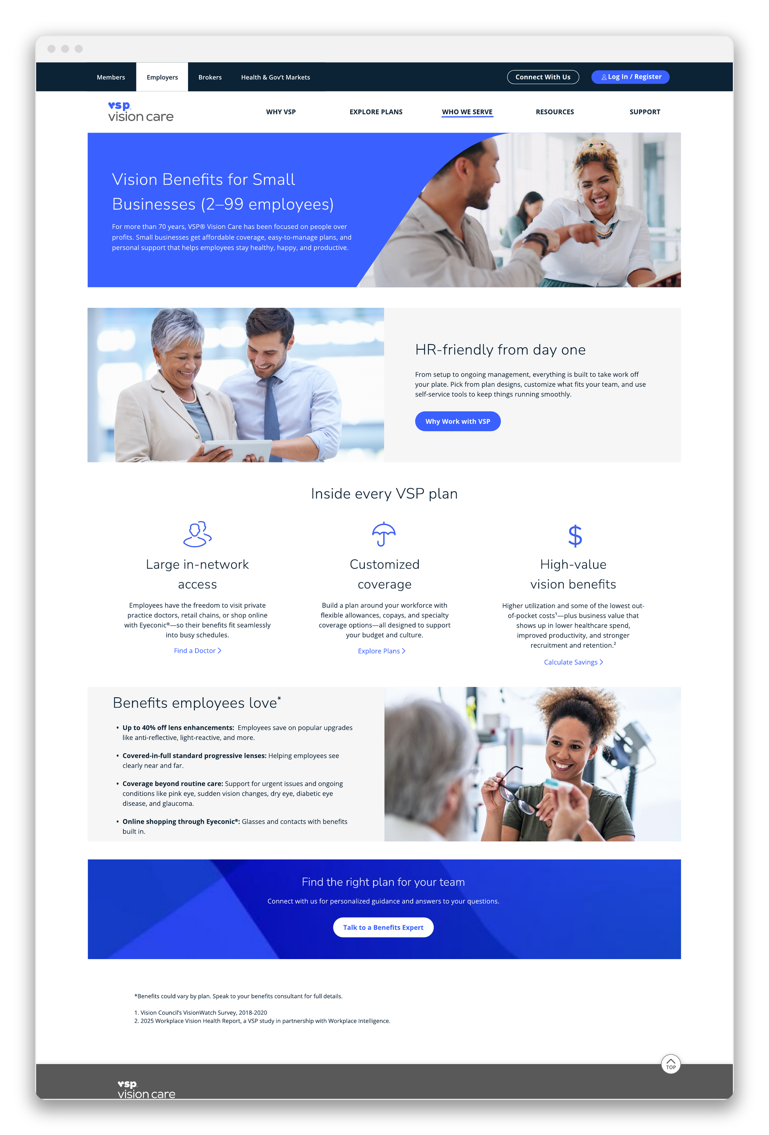
The Segmentation System
The redesign's real test: One template, three employer sizes. Small businesses, midsize employers, and large enterprises each get their own entry point, messaging, and layout structure. Built from the same component library and design system instead of starting from scratch three times..
Resources & Content Hub
This is where the case study closes its loop. The Resources hub gives HR teams practical-insight articles, a savings calculator, and communication toolkits in one place, and it's built around the same Workplace Vision Health Report this case study opened with, now with its own gated landing page living permanently inside the portal instead of a one-time campaign send.
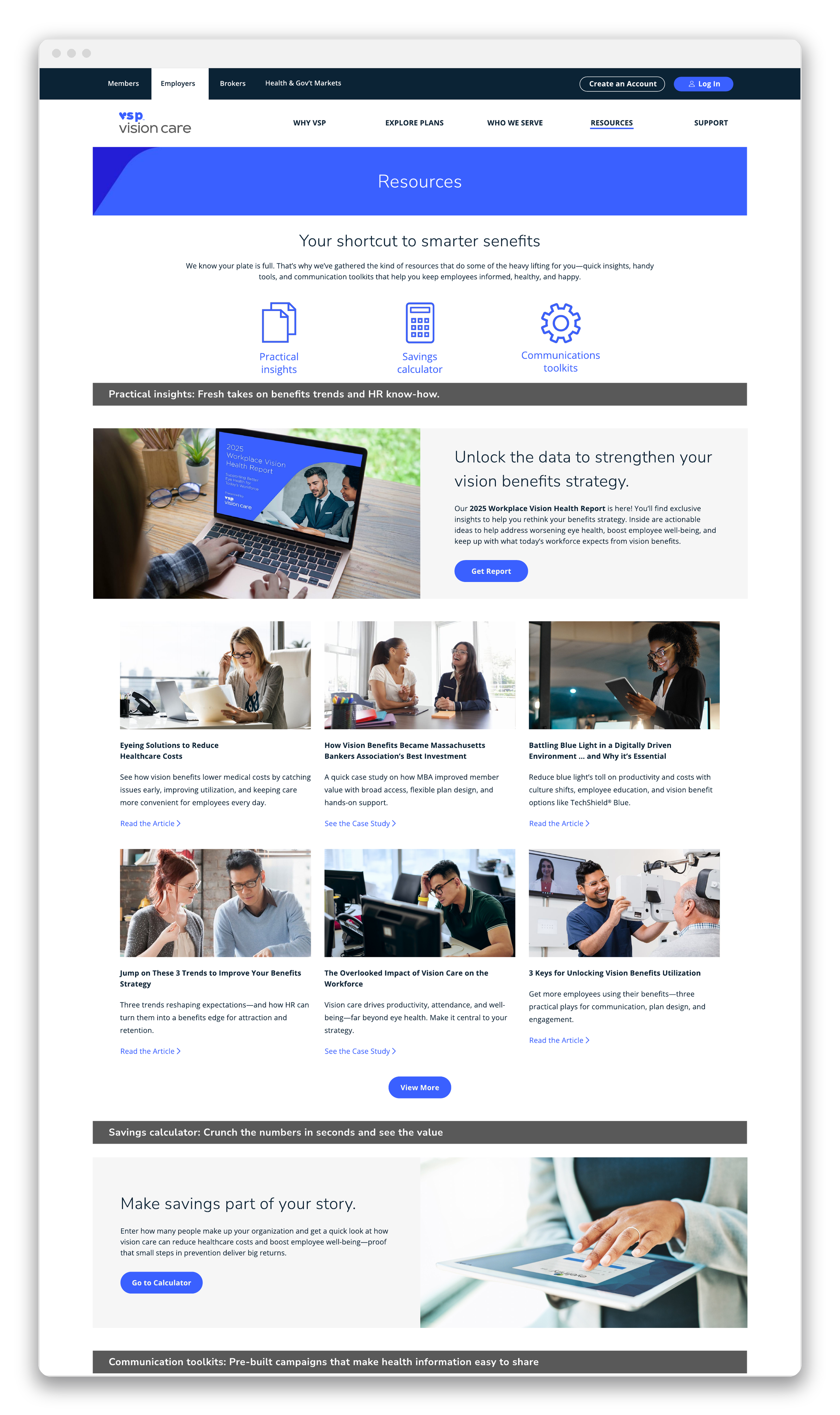
Resources Hub
Insights, a savings calculator, and toolkits organized by what an HR admin is trying to do, not by content type.
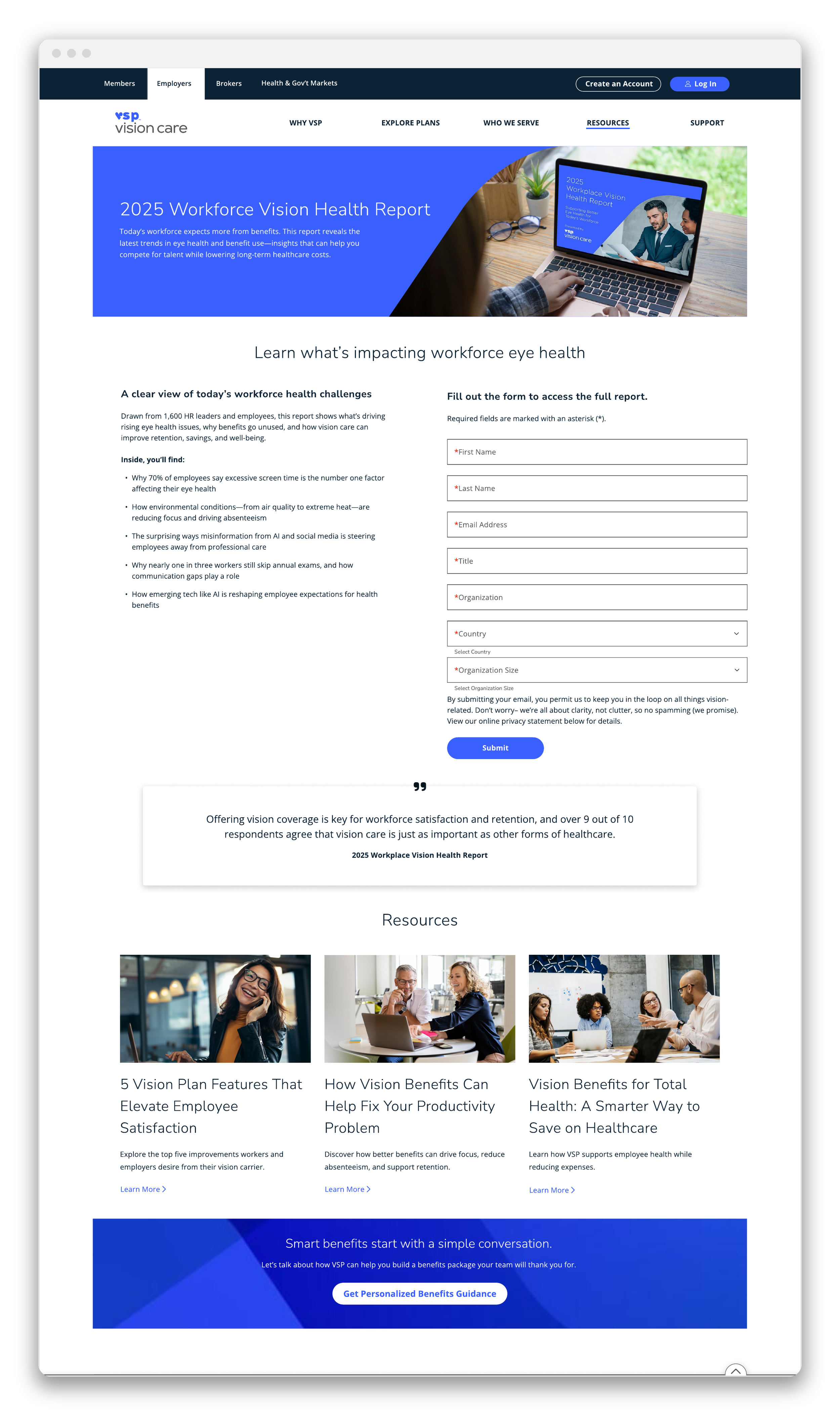
The Report, Rehomed
Same report from the top of this case study, now living inside the portal it used to just point traffic toward.
The SHRM25 Event
SHRM25 wasn't a separate campaign. It was part of the same 2025 demand gen effort this whole case study is built around, presented live instead of read in an inbox. The Society for Human Resource Management's annual conference put VSP in front of thousands of HR and benefits professionals at the San Diego Convention Center, backed by a parallel virtual track for remote attendees. Running alongside it, a SHRM Benefits Trends Virtual Retreat carried the same core session to a broader HR audience who weren't at the conference at all.
Both threads led back to one fireside chat, "It's Not Just About Benefits, It's About Whether Your Benefits Signal Care," presented by Dr. Valerie Sheety-Pilon and Louis Martinez. It drew hundreds of live viewers polling in real time, and pulled its argument directly from the Workplace Vision Health Report.
The Strategy
Each thread got its own visual register. "California Dreamin'" gave the SHRM25 presence a seasonal, San-Diego-coded palette: Ocean teal, sunset gold, a custom script wordmark. The Virtual Retreat leaned on straightforward editorial photography instead, so it reads as its own thought-leadership series.
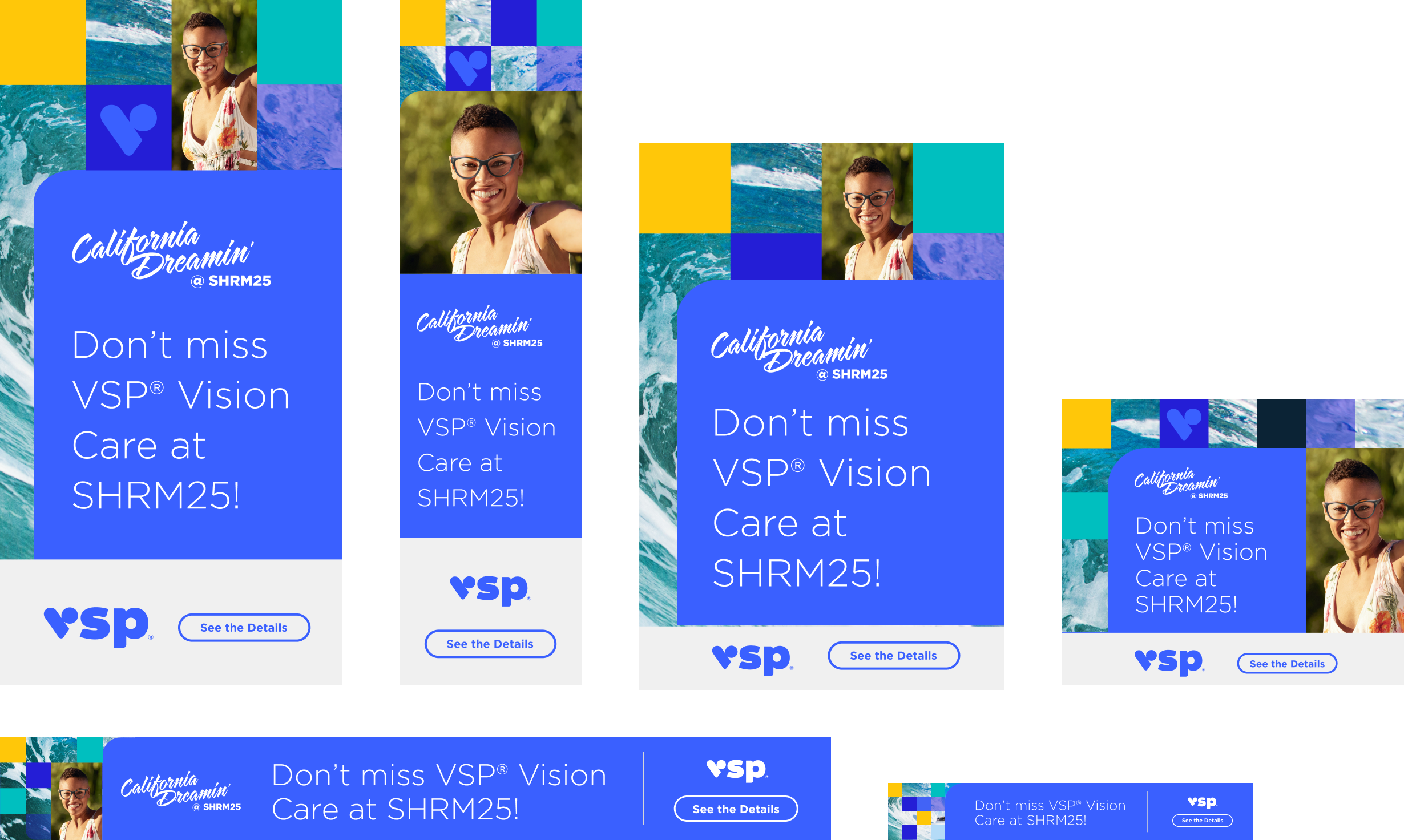
I built the full media plan across both: LinkedIn single-image and messaging ads, Simpli.fi programmatic HTML display in five IAB sizes, an HTML5 display unit for the Virtual Retreat, an e-newsletter inline placement, and in-person and virtual landing pages. One message, resized and re-skinned for wherever an HR professional happened to be looking.
In-Person vs. Virtual Landing Page
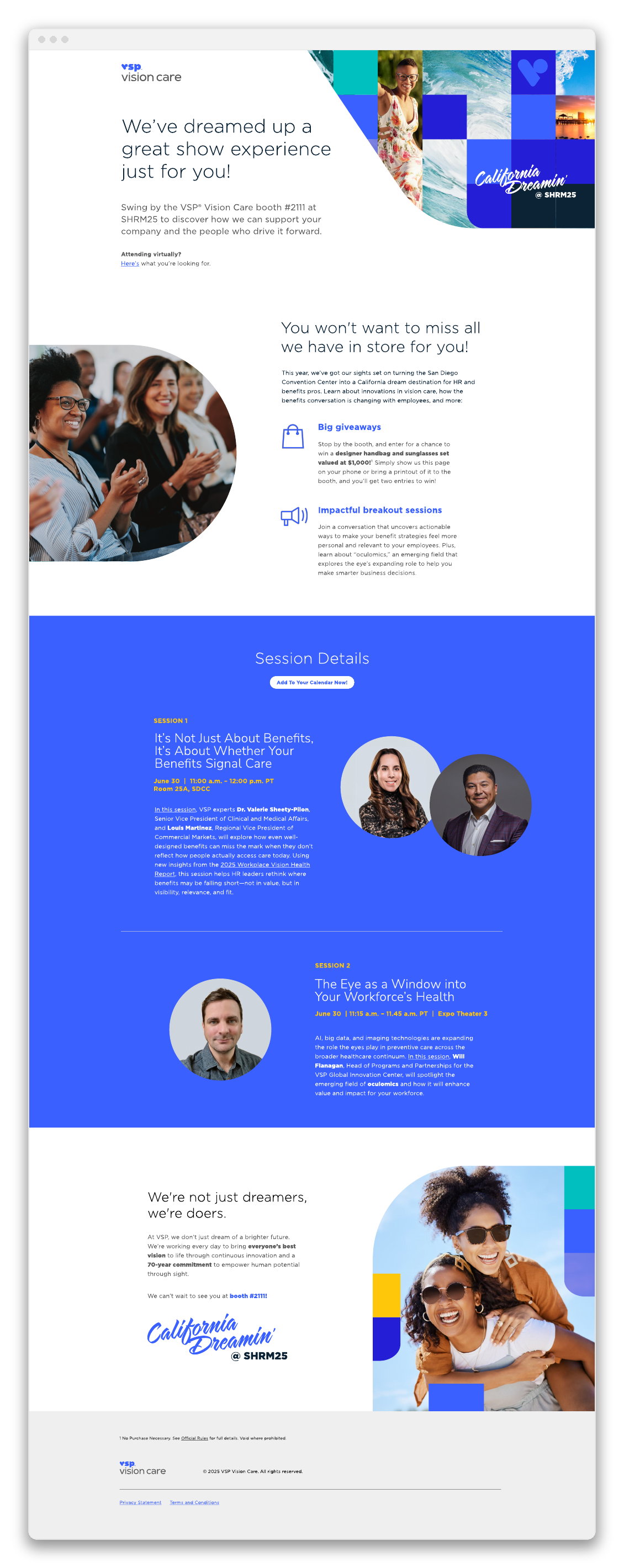
In-person: Booth number, giveaway mechanic, and session schedule up front for badge-scanning attendees on the show floor.
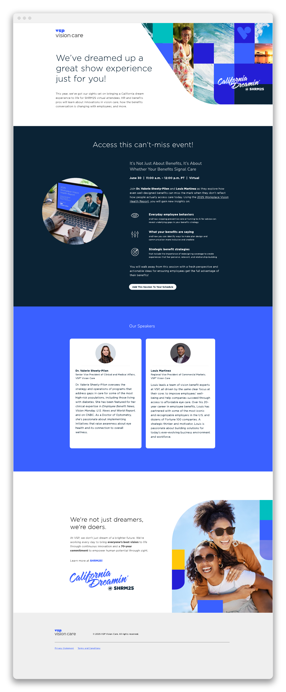
Virtual: Same system, restructured so speaker bios and session takeaways come before the booth details a remote attendee doesn't need.
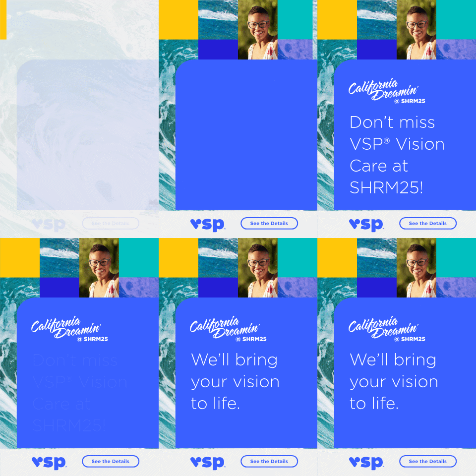
Simpli.fi Display Ad System — California Dreamin'
One creative, five IAB standard sizes. I built the system so the Simpli.fi programmatic buy could run across the full SHRM25 sponsorship package without the message getting lost in translation at 320x50.
The Fireside Chat
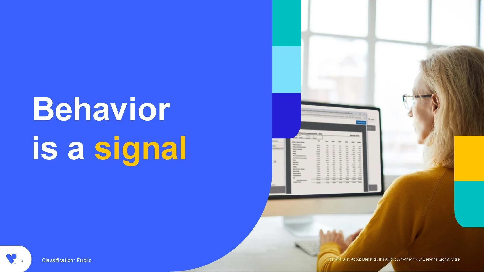
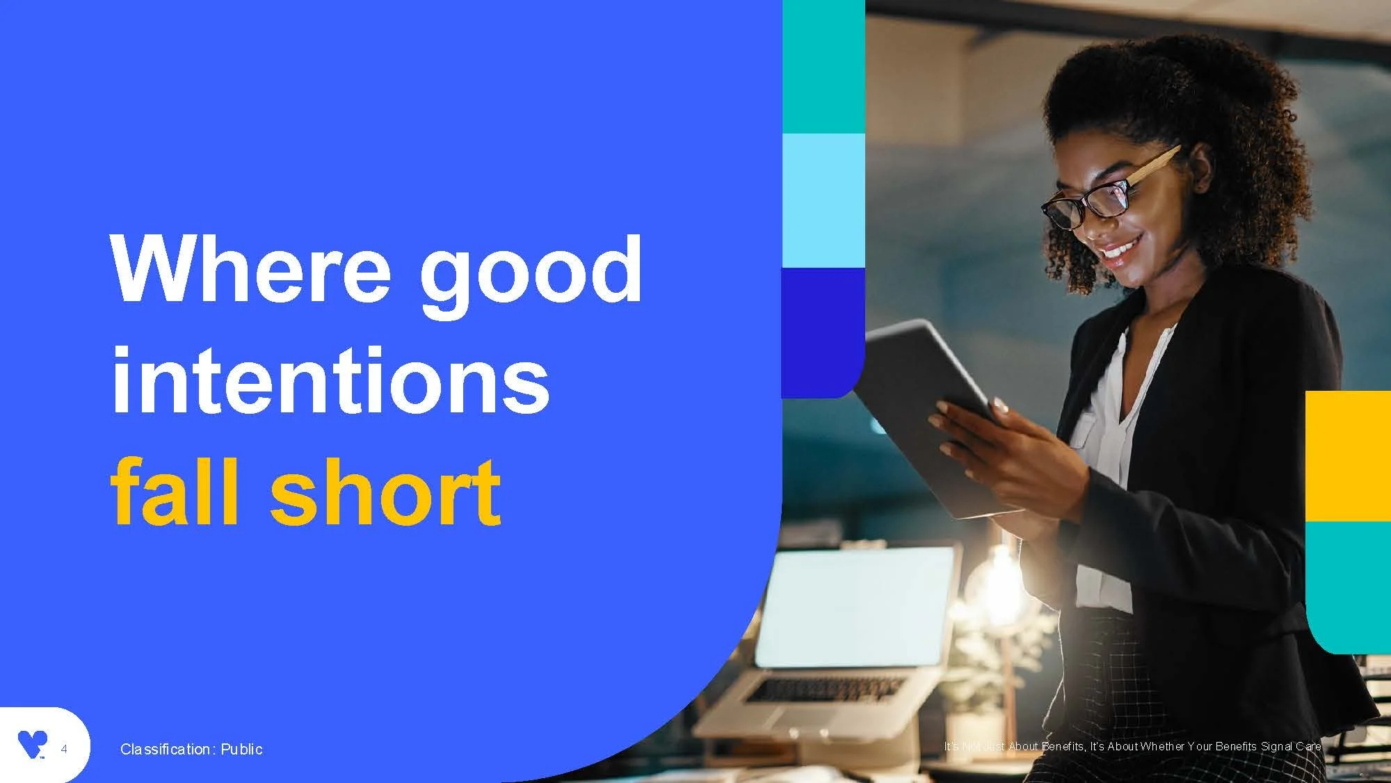
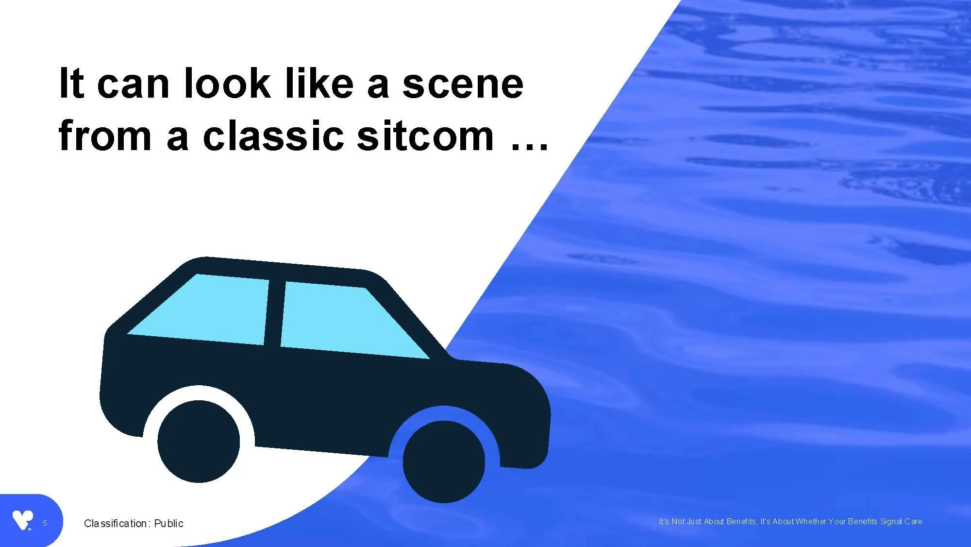
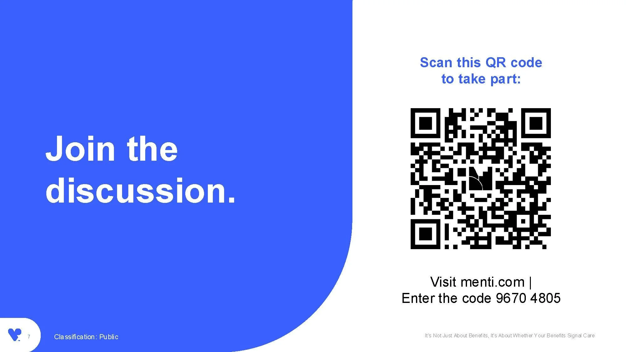
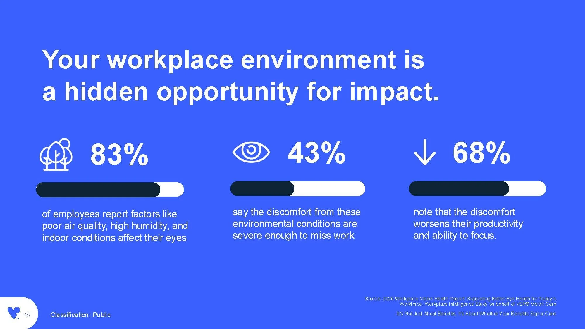
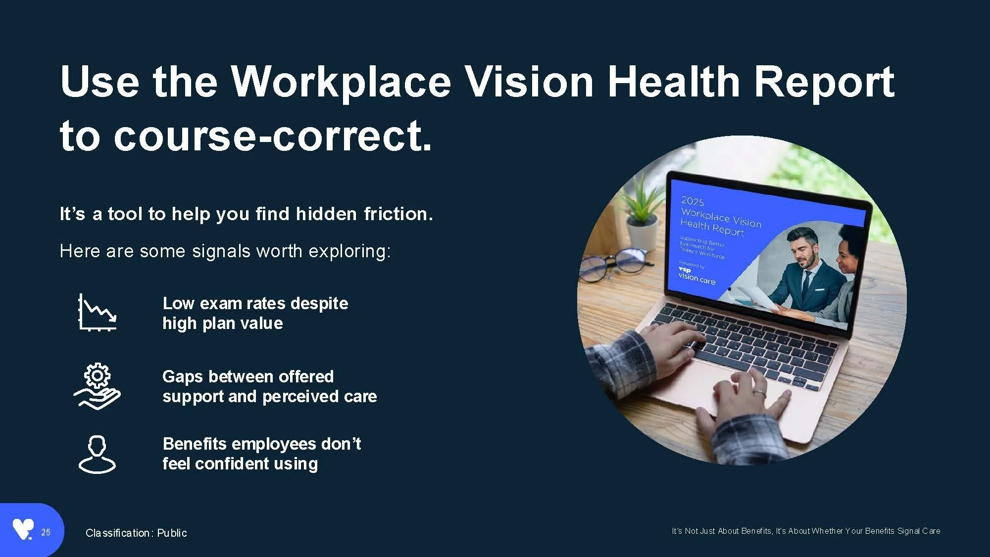
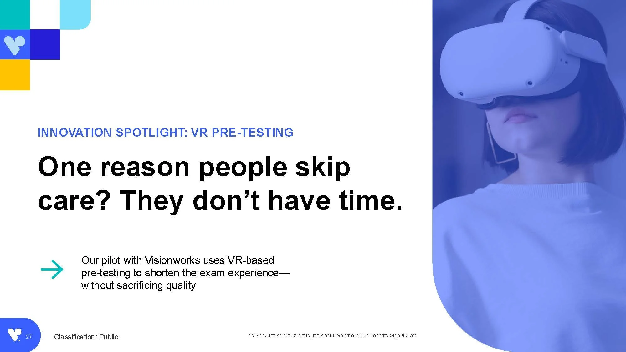
"It's Not Just About Benefits, It's About Whether Your Benefits Signal Care" sat at the center of both campaigns. Dr. Valerie Sheety-Pilon and Louis Martinez presented it live to hundreds of concurrent viewers, who polled in real time throughout. The deck translated the Workplace Vision Health Report's research into a talk track HR leaders could act on right away, closing the loop from report to ad to landing page to a live room discussing the findings.










Results
This case study runs to a dozen distinct deliverables built from one piece of research, from the report itself down to a single social ad, and the campaign that carried them reached 1.37M LinkedIn impressions in its first month alone. Every one of them traces back to a single visual system, tested in the places a hero shot never has to survive: a phone screen mid-scroll, a printed white paper, a conference booth wall.
It held up live, too. The fireside chat deck built from this research reached hundreds of HR and benefits professionals watching Dr. Valerie Sheety-Pilon and Louis Martinez present it in real time, polling throughout, proof the same argument that worked online also worked in front of a room.
The portal redesign got its own kind of proof. The old Why VSP page argued its case with a slogan; the new one argues with numbers, $489 in average savings, 137,000 access points, three employer tiers with their own copy, built from one template instead of three. VSP's marketing team now builds every new research release and event from that same template, instead of starting from a blank file."
Work created at ID/2X. Creative direction by Kelli Krenik and Pete Fenger. Copywriting by Andrea Goyma and Heather Hoffman.