

The Project
Most consumers had never heard of community solar, making education just as important as conversion. The website needed to explain how community solar worked, communicate its benefits, and help users quickly determine whether it was available in their area.
At the same time, the experience needed to feel approachable rather than technical. The challenge was balancing educational content with an intuitive interface that guided users toward finding a local community solar provider while reinforcing trust in the brand.
Finding the Opportunity
Rather than relying on technical explanations or industry jargon, we focused on creating a welcoming experience that made renewable energy feel simple and accessible. The creative direction centered on clean layouts, friendly illustrations, and a warm color palette that reflected sustainability without leaning into the visual clichés often associated with the energy industry.
The experience also served as a provider search tool, helping visitors quickly determine availability while learning about the benefits of community solar.
Homepage static slides
The homepage introduced community solar in approachable terms while making it easy for visitors to search for participating providers and take the next step.


Building the Experience
Every design decision supported the goal of making community solar easier to understand. I designed a flexible page system and responsive experience that guided users naturally from education to action, helping them learn about community solar before connecting with a local provider.
Clear content hierarchy, thoughtful iconography, and modular components simplified complex information while creating a cohesive design system across educational resources, provider listings, and mobile experiences. Key actions were surfaced early to reduce friction and help visitors move confidently from learning about community solar to finding a participating provider.

Building the Visual Language
One of the project's key creative decisions was establishing an illustration style that made community solar feel approachable rather than technical. Although the illustrations originated from a curated library, I intentionally selected artwork that aligned with the brand's personality and built the surrounding visual system to create a cohesive design language.
Warm colors, generous white space, and clean typography reinforced a sense of clarity and optimism while making educational content easier to absorb. Every visual element supported a consistent visual language that felt friendly, trustworthy, and approachable, encouraging users to explore complex information with confidence.

Wireframes
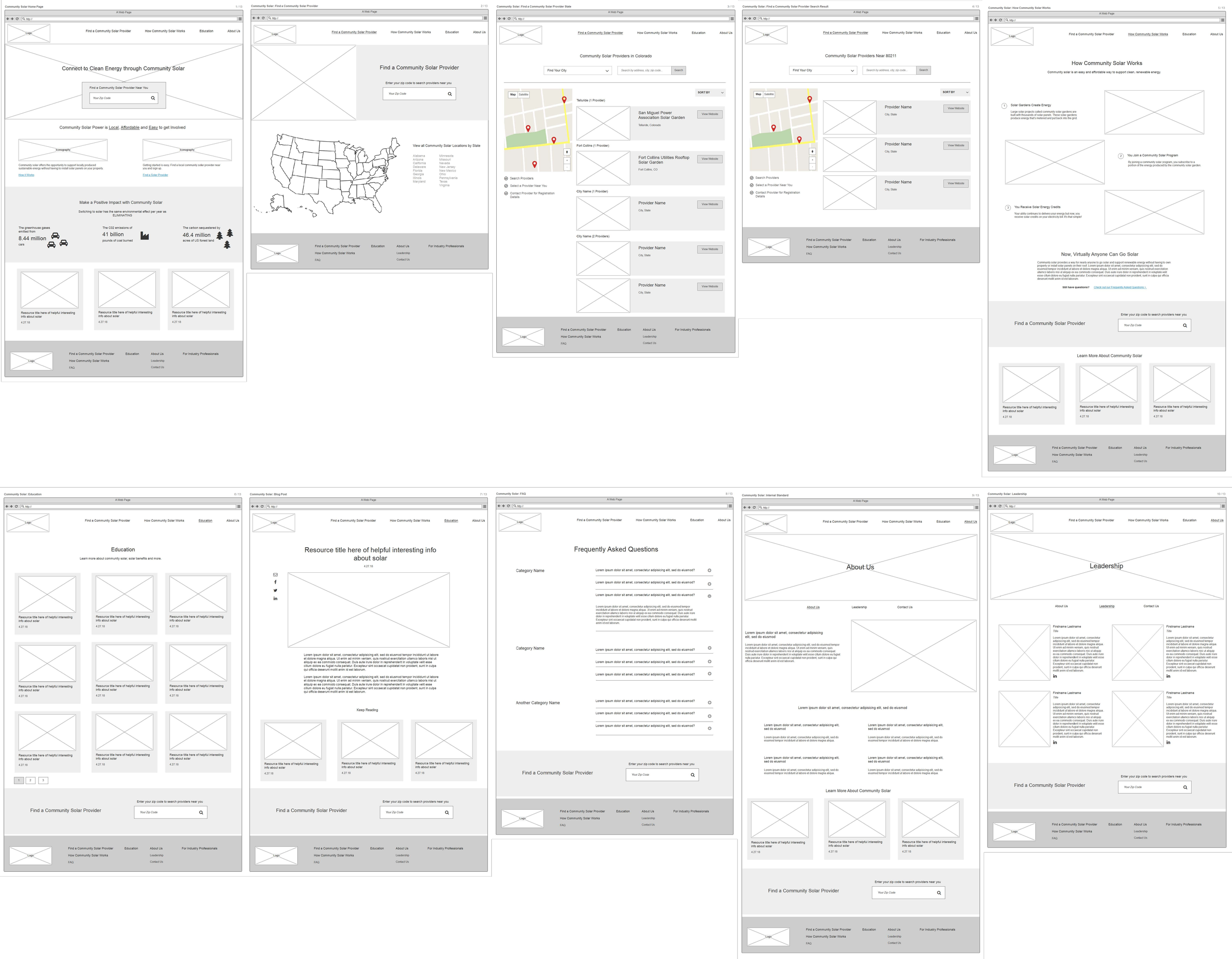
Interior page templates
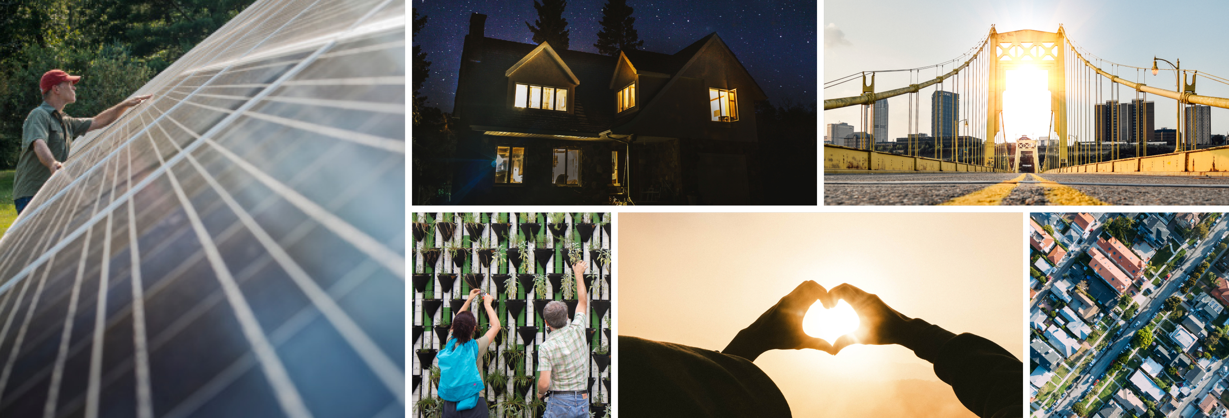
Photography
Photography complemented the illustrated interface by grounding the experience in real communities and everyday life. Rather than focusing on industrial infrastructure, imagery highlighted people, homes, and neighborhoods benefiting from renewable energy.
This balance between illustration and photography helped the brand feel optimistic, approachable, and rooted in real-world impact.
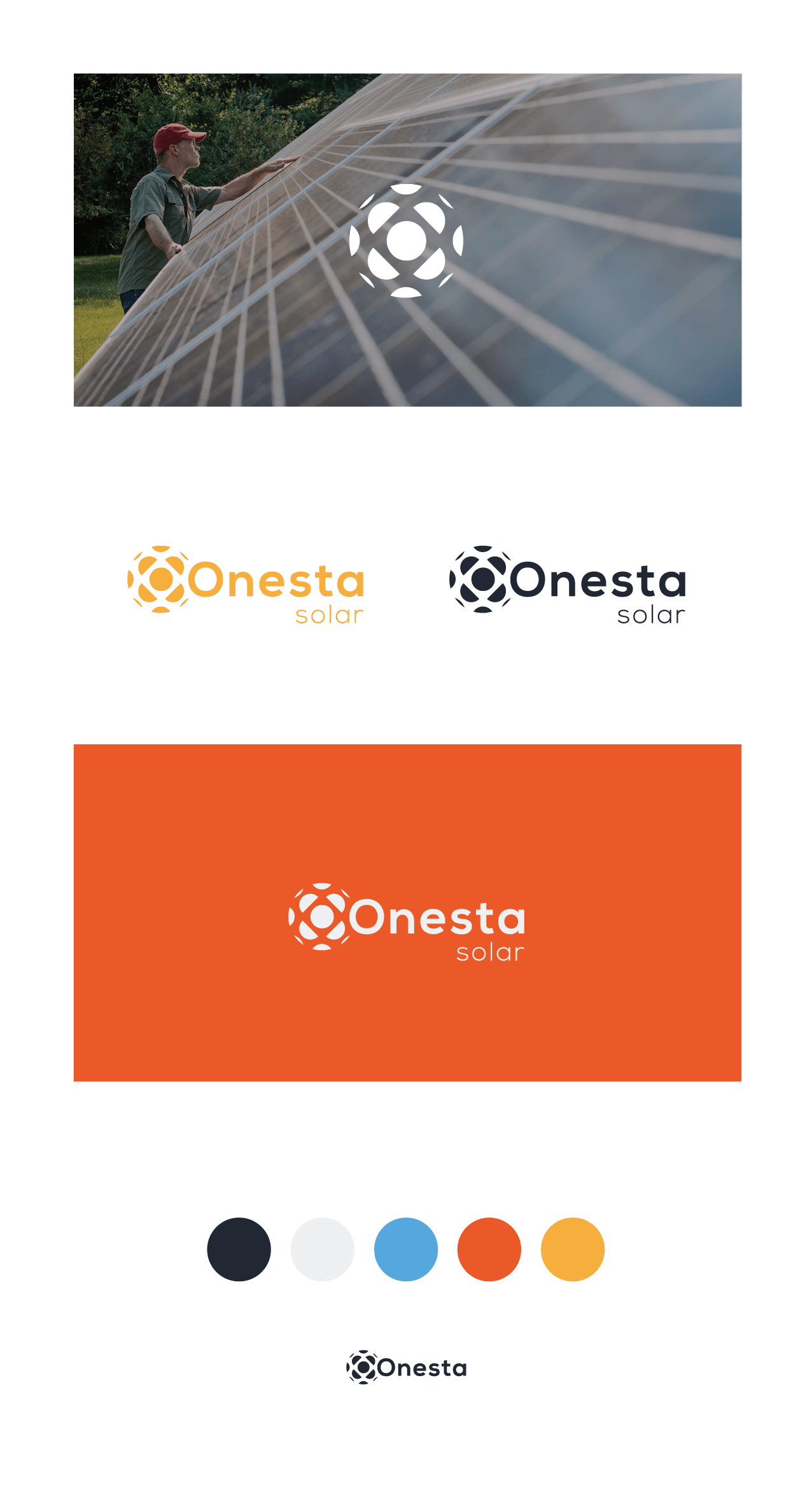
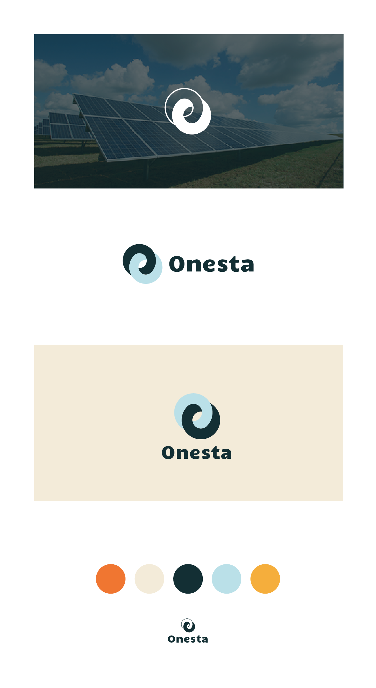
Logo and Exploration
Alongside the website, I explored several logo directions that reflected Onesta's mission of making clean energy feel simple and accessible. Each concept balanced modern sustainability with warmth while remaining recognizable and flexible across digital applications.


Mobile in action
The responsive experience preserved the site's educational focus while simplifying navigation and provider search across every device.
